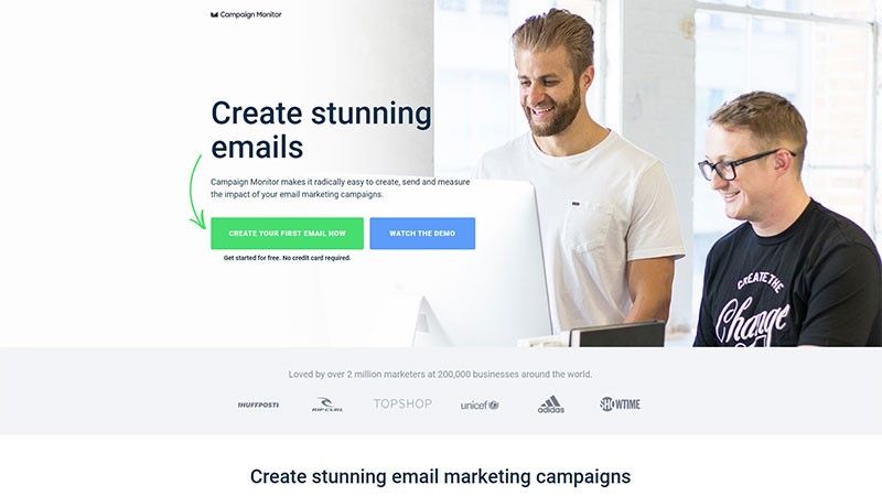
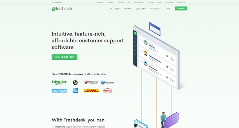
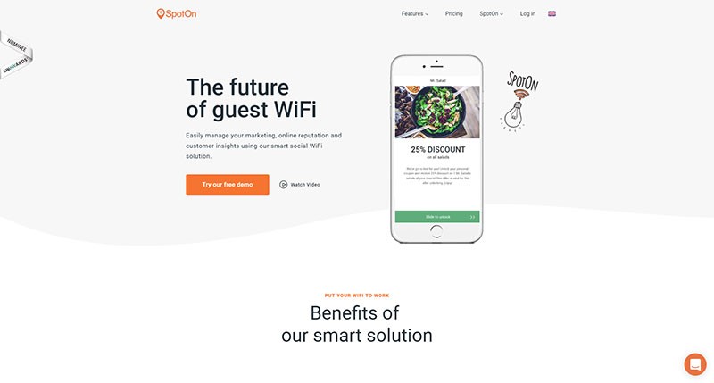
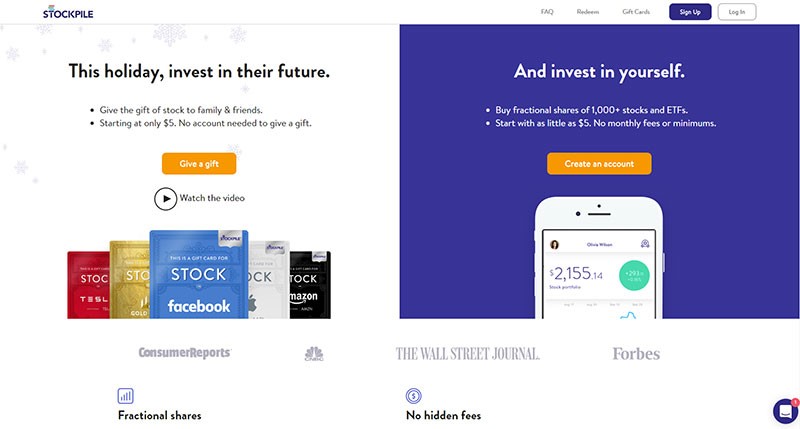
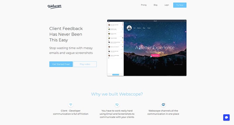
When you’ve got your website up and running, you’ve taken out the search engine and Facebook adverts you need, and you are getting lots of traffic, and people are landing on your page, what do you do when your viewers go no further? In other words, they do not convert into clients or customers?
A good landing page is an essential aspect of web design. This means that when viewers land on your site, they will take action.
A good landing page makes it easy. But how do you create a landing page which converts?
You want your landing page to give an excellent first impression. This impression is created in the blink of an eye.
Internet users are impatient, and won’t stay long on your site if it does not appeal. You want your audience to linger long enough to convert from visitor to customer.
Decide on your specialty
What makes your site unique (your unique selling point or USP), or sets you apart from your competition? Declare what you offer that your competition doesn’t have on your landing page. Do so obviously, so that viewers are in no doubt.
In order to declare your USP you could use your headline, a subheader or a value proposition. Make sure it POPS out at your reader. If your viewers bounce off your page (go no further than a simple landing), rethink how your USP is being communicated.
Also, use a website layout that leads the user to your unique selling point and to the call to action.
Five ways to get your message across:
- Keep your language simple and concise. This will mean that your viewers understand exactly what you offer without confusing terms of difficult jargon.
- Use the word ‘free’ as a reward to encourage users to engage. This could mean a free trial or sign up period. There could also be a ‘buy one, get one free’ deal, or a discount code or coupon to be used within a specified time period.
- Create a comparison to a well-known brand. Show how you stand up to your competition (make sure you can back it up).
- Share how your viewer will receive a return on investment. Will landscaping their garden improve the curb appeal of a home? Share this so that your user understands the purpose or benefit of investing their money into a product.
- Show long-term or immediate benefits. This means showing your users how your product or service will assist them. Will they be eligible for promotion by taking an online course? Point this out. Give references from past customers to back up your point.
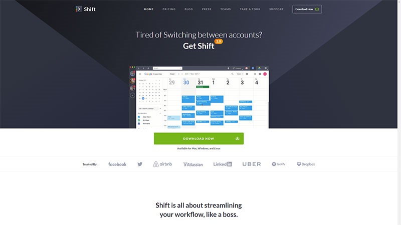
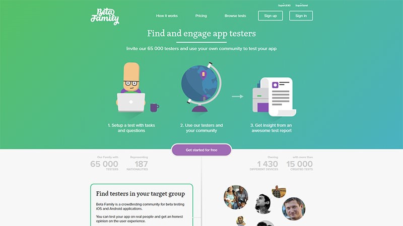
Use a call to action
Your call to action is one of the most important aspects of your landing page because it asks users to engage further. It should be a focus of your page.
Making your call to action seem appealing is crucial if you want to convert viewers into subscribers or clients.
The following prompts invite a call to action:
- Sign up
- Learn more
- Free Download
- Start your Free Trial
- Create an Account
Evoke user imagination
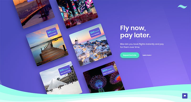
By representing the brand visually, you aim to show your viewers what your product or service looks like, and how it will be of benefit.
A sportsman, crossing the finish line, arms raised in delight will show the benefit of a good pair of running shoes.
Your goal is to get your user to imagine himself in this situation. You can use photos or videos to showcase your product, showing how it will bring benefit to your user’s everyday life.
Share the benefits
Your user won’t want to buy a product unless it offers benefit. Speak directly to your customer, sharing what your product offers. Go into detail.
Your headline and images may attract user attention, but by engaging further, you encourage your user to delve deeper.
Try to answer any questions which may arise. Use bullet points for easy understanding. Make your wording clear and concise so that your user understands what you are saying.
Offer Proof
Share research, customer testimonials and articles on your product.
Offer up proof from scientific studies. Show reviews from people who have purchased the download and have found it helpful.
Explain clearly how your product provides an example of these services, and why users would benefit from making a purchase.
Tips for keeping it simple
Your landing page is there to invite a call to action. Keep it simple. You can add a link to a home page to share additional information later on.
Keep your product page separate. Your goal is to keep your viewer from getting distracted or feeling lost. You want your viewer to focus on the call to action.
Limit extra navigation, which could distract your viewer from the Call To Action. You don’t want your viewer to move from the landing page too quickly.
Keep your objective clear and simple. Don’t add too much information beyond sharing your brand, purpose and value. Only add what is necessary to carry out this goal. The call to action should be clear and visible.
Make sure the content is consistent with what your visitor has previously seen or heard about your brand. Any feeling of disconnect will make your visitors feel lost or as though they are in the wrong place.
Your landing page must add something of value to your customer. Your visitor has to be shown the benefits of engaging further.
Be flexible and engaging with your landing page. Find out what appeals to your customers and offer it up. Change your landing page when you offer new products. This will give you the opportunity to convert internet traffic into new clients or customers.
Summary
Your landing page is the place where you showcase your brand or design, inviting visitors to become loyal customers.
A powerful landing page will bring business goals to fruition. Showcase a brand, sharing the benefits and offering the opportunity to sign up. Then stay flexible, improving and developing your page as needs arise.

