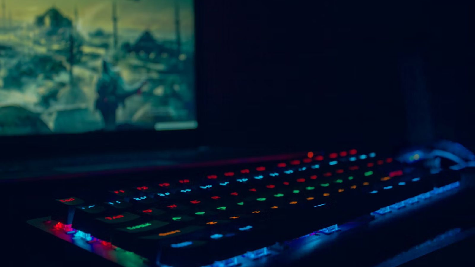
Ever wonder why tapping a button in your favorite mobile game feels so satisfying? That little bounce, the flash of color, the subtle shake when something goes wrong. It’s not accidental. Game designers have spent years perfecting these tiny moments, and they’ve figured out something the rest of the digital world is just catching up to: micro-animations aren’t decoration. They’re the reason people stick around.
The Tiny Details You Don’t Notice (But Your Brain Does)
Here’s the thing about micro-animations. They last somewhere between 200 and 500 milliseconds. That’s faster than a blink. Yet those fractions of a second shape how we feel about an entire experience. A health bar that pulses red when you’re low on life? That’s not just informative, it’s emotional. It creates urgency without a single word of text.
Games like Monument Valley and Ori and the Blind Forest have built entire reputations partly on how their interfaces feel. Every swipe, every tap gets a visual response that tells you “yes, that worked” or “nope, try again”. And that feedback loop is powerful stuff. Studies suggest that well-implemented micro-interactions can keep up to 76% of users engaged with a platform. Meanwhile, poor interaction design ranks as one of the top three reasons people abandon an app entirely.
So why should designers outside of gaming care? Because your users have been trained by games to expect this level of responsiveness. They carry those expectations everywhere.
What Game Designers Actually Get Right
Let’s talk about what makes gaming UI special. It’s not just that things move. It’s that everything moves with intention.
Think about loot boxes. Love them or hate them, the animation sequence when one opens is a masterclass in anticipation. There’s a glow, a shake, a dramatic pause, then the reveal. That’s classic animation principles at work: anticipation, staging, and follow-through. Game studios borrow from Disney’s playbook and apply it to pixels on a screen.
Then there’s onboarding. Mobile games have cracked this nut better than most SaaS products ever will. A sparkle when you tap the right button. A gentle nudge animation pointing you toward the next step. Confetti bursting when you complete your first level. These micro-moments make players feel smart and rewarded from the very first session.
Platforms in the iGaming space have picked up on this too. If you look at how sites like Betinia NJ design their interfaces, you’ll notice that same attention to responsive feedback, smooth transitions between game lobbies, and visual confirmation when actions complete. It’s all borrowed from the gaming playbook.
Speed Is the New Spectacle
One trend worth noting: animations are getting faster, not fancier. Players in 2026 don’t want elaborate transitions that slow them down. They want instant feedback. A tap should feel like it registers immediately, even when there’s processing happening behind the scenes.
This is where the psychology gets interesting. Quick micro-interactions create a sense of control. When the interface responds immediately, users trust it more. They feel like the system is listening. That trust translates directly into longer sessions and higher retention.
The flip side? Overdo it and you’ll annoy people. An animation that plays every single time someone scrolls, or a button that bounces for two full seconds, becomes noise. The golden rule from game design is simple: every animation needs a purpose. Guide the user, confirm an action, or communicate a state change.
Borrowing the Playbook for Your Own Projects
First, celebrate small wins. When a user completes a form, submits an order, or finishes a task, give them something. A subtle checkmark animation, a color shift, even a gentle pulse. It doesn’t need to be dramatic, just present. Research shows that brands using these “surprise and delight” moments see roughly 90% of users developing a more positive perception of the product.
Second, use motion to teach. Instead of writing long tooltips or instruction manuals, let animations show what’s clickable, what’s draggable, and what happens next. Games have almost eliminated traditional tutorials by making the interface itself the teacher.
Third, respect user preferences. Accessibility matters. Some users have motion sensitivity, and modern operating systems let people request reduced motion. Good animation design includes fallbacks for those settings. Game studios learned this lesson, and everyone else should too.
It’s Not About Flash, It’s About Feel
The real takeaway from gaming UI isn’t that you need particle effects and 3D transitions everywhere. It’s that every interaction is an opportunity to communicate. A button that responds when pressed tells users the system is alive. A loading animation with a progress bar tells them to hang tight. A shake on an error field tells them exactly where to look.
These moments add up. They turn a functional interface into something that feels crafted, considered, and human. And that feeling? That’s what keeps people playing, clicking, and coming back tomorrow.
About the Author

Peter Makeshoff
Peter Makeshoff is the founder and main author of Designer Daily.