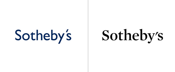
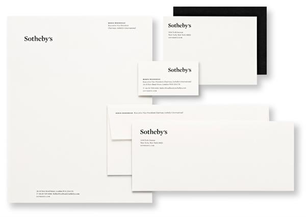
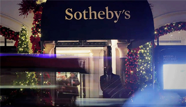
Sotheby’s recently announced a redesign of their logo by Pentagram. As usual, it’s brilliant work by Pentagram, with a choice of font much more suitable for the auction company. This said, I find that the apostrophe in the new logo looks really aweful, wasn’t there a way to make it look nicer? Via Brand New.
About the Author

Peter Makeshoff
Peter Makeshoff is the founder and main author of Designer Daily.