
Rebranding is one of the most expensive and risky investments a company can make. When it works, it revitalizes a stagnant brand, attracts new audiences, and drives growth. When it fails, it confuses customers, alienates loyalists, and burns millions. Here is what actually worked for real brands, what backfired, and what any designer can learn from both.
What Worked: Mailchimp (2018)
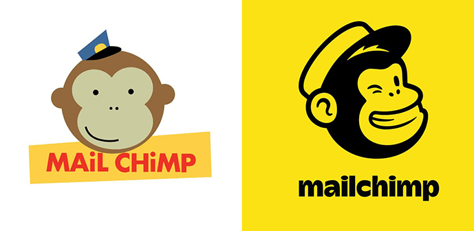
Mailchimp’s 2018 rebrand was a masterclass in gradual, confident evolution. The email marketing platform had outgrown its quirky, frat-house origins. The business now served enterprises, yet the brand still felt small. The redesign, led by Collins, kept the iconic monkey mascot but matured everything around it.
What they changed. The brand introduced a custom typeface (Means) that was clean but still playful. The color palette expanded from yellow to include deeper blues and purples, signaling sophistication without losing warmth. The illustration style became abstract, colorful, and unmistakably unique.
What worked. Mailchimp did not throw away what people loved. The monkey stayed. The name stayed. The irreverent voice stayed. But every element matured one step, creating a brand that could sit next to Salesforce and Slack without embarrassment. The risk was managed by staying recognizable.
The metric. Revenue grew from 700 million in 2018 to over 1.4 billion by 2021. The brand could now compete for enterprise contracts that would have laughed at the old identity.
Takeaway for designers. Evolution beats revolution. If your client has existing brand equity, protect the recognizable elements. Mature them. Do not erase them.
What Worked: Dunkin’ (2019)
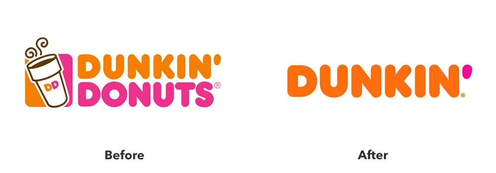
Dunkin’ (formerly Dunkin’ Donuts) made a seemingly small change with massive strategic implications. The company dropped “Donuts” from its name and logo, signaling that it was a beverage-led brand, not a donut shop.
What they changed. The wordmark was simplified, the pink and orange colors were brightened, and the cup design became cleaner. The donut icon was demoted from the logo to a supporting character.
What worked. The change was honest. Dunkin’ sold more coffee than donuts. The new name reflected the business reality. The visual refresh was modern but not jarring. Customers barely noticed the shift, yet the brand was fundamentally repositioned.
The metric. Same-store sales increased for three consecutive years following the rebrand. The company expanded its beverage offerings and became a serious competitor to Starbucks in the morning daypart.
Takeaway for designers. A rebrand does not need to be dramatic to be strategic. Sometimes the most effective change is aligning the visual identity with the actual business model.
What Worked: Burberry (2018)
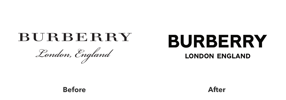
Burberry’s rebrand under Riccardo Tisci and Peter Saville was a case of radical change executed with precision. The British heritage brand needed to shed its chav association and appeal to a younger, global luxury audience.
What they changed. The classic equestrian knight logo was retired. A new monogram (TB for Thomas Burberry) was introduced, designed in a stark, almost brutalist sans-serif. The color palette shifted from beige and red to orange, white, and black. The brand voice became sharper, more streetwear influenced.
What worked. The new logo was designed for digital-first visibility, not heritage display. The bold orange created immediate recognition on phone screens and Instagram feeds. The TB monogram, woven into scarves and bags, created a new iconography that felt fresh but still rooted in the founder’s initials.
The metric. Burberry’s stock price rose 40% in the 18 months following the rebrand. The brand became culturally relevant again, collaborating with街头品牌 and appearing on young celebrities.
Takeaway for designers. Radical change works when you replace the old symbols with new symbols of equal or greater meaning. You cannot just remove heritage. You must build new heritage.
What Didn’t Work: Gap (2010)
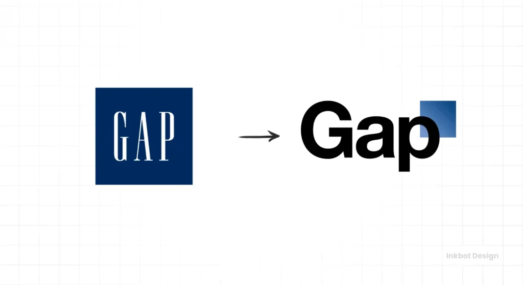
Gap’s 2010 logo redesign is the cautionary tale every designer learns in school. The company replaced its iconic blue box logo with a small, generic black sans-serif wordmark and a tiny blue square floating awkwardly above it.
What they changed. Everything that made the logo recognizable. The blue box was shrunk to an afterthought. The classic serif was replaced with Helvetica. The logo lost all warmth, personality, and distinctiveness.
What failed. The new logo was not just different. It was worse. The typography was fine but forgettable. The floating square had no relationship to the word below. The entire composition felt like a junior designer’s second draft.
The backlash was immediate and brutal. Customers mocked the logo online. Design critics tore it apart. Within six days, Gap reverted to the old logo and scrapped the rebrand entirely.
The cost. The failed rebrand reportedly cost millions in wasted agency fees, production, and public embarrassment. The company learned the hard way that change is only valuable if it is improvement.
Takeaway for designers. Do not present work that is worse than what the client already has. If your new logo is less distinctive, less recognizable, and less appealing than the existing mark, you should not be showing it.
What Didn’t Work: Tropicana (2009)
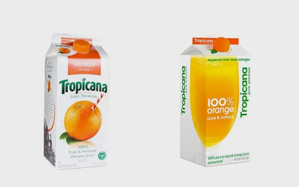
Tropicana’s 2009 packaging redesign is a masterclass in solving the wrong problem. The company wanted to modernize its orange juice cartons, so it removed the iconic orange with the straw and replaced it with a generic glass of juice and stark Helvetica typography.
What they changed. Everything. The brand name moved to the center of the package. The famous orange was gone. The straw was gone. The new design looked like a store brand, not a premium product.
What failed. Tropicana underestimated how much consumers loved the straw-in-orange image. That image was not decoration. It was a navigation tool. Shoppers found Tropicana by scanning for the orange. When the orange disappeared, customers grabbed other brands by mistake.
The cost. Sales dropped 20% in two months, representing an estimated $50 million in lost revenue. Tropicana scrapped the redesign and returned to the original packaging.
Takeaway for designers. Understand how customers actually use your packaging. A design that looks cleaner on a screen may completely break the real-world shopping behavior of scanning, pattern recognition, and muscle memory.
The Common Thread
Successful rebrands share three traits. They protect existing equity while adding new value. They test changes with real customers before full rollout. And they commit fully to the new direction, avoiding the half-measures that create confusion.
Failed rebrands share their own pattern. They change elements that customers used as navigation. They prioritize internal aesthetics over external recognition. And they revert at the first sign of criticism, proving the original strategy was never confident.
The Bottom Line
A rebrand is not a logo swap. It is a business transformation expressed visually. The most successful case studies succeed because the business changed first, new products, new audiences, new strategy, and the design followed. The failures happen when the design changes and the business hopes customers will follow. That almost never works.
About the Author

Peter Makeshoff
Peter Makeshoff is the founder and main author of Designer Daily.