Typographic inspiration, tools and resources. Find even more on our typography blog.
Their website is a bit strange to navigate, but their graphic design work is just stunning. Check it out.
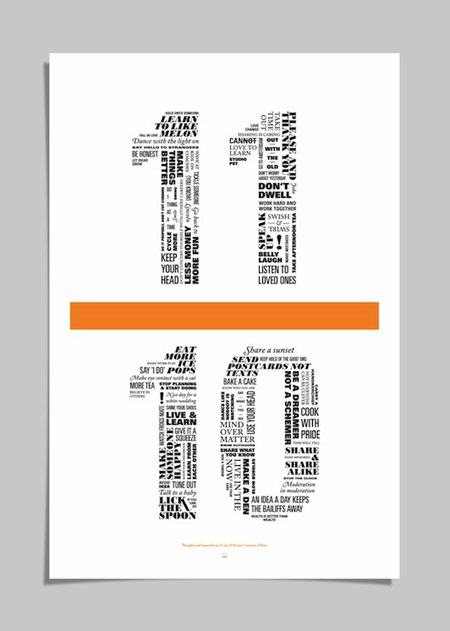
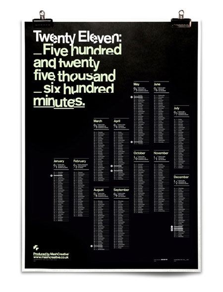
Good size differences between titles and text usually makes the page more readable. How about huge font sizes? Well, it doesn’t always make the page more readable, but it quite often makes it much more stylish. These web designs using big typography are good examples. 1. Stephen Caver 2. Polecat 3. Fusion ads bundle 4. […]
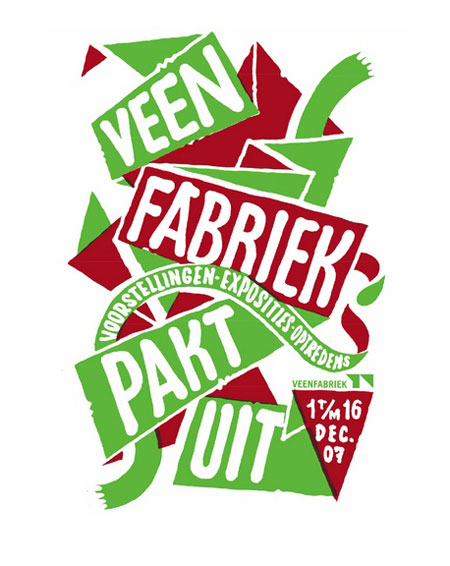
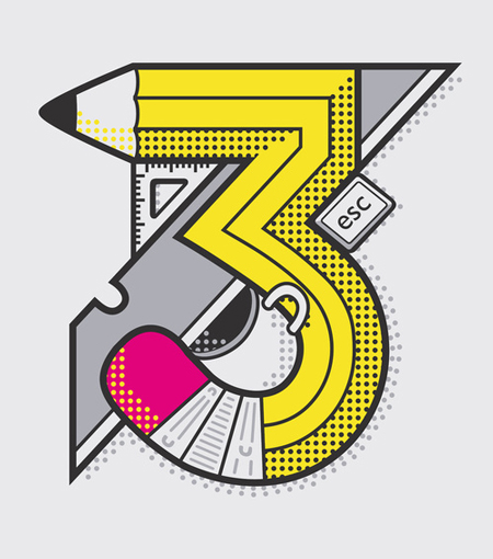
Looking at these flyers, it seems quite obvious that Letman loves drawing letters. See all his flyers here.