Jazz en Juin is a music festival that takes place in June in the city of Québec, Canada. It’s a new festival that will hold its first edition in June 2019, so they had to build a visual identity that stands out and attracts music fans.
For that purpose, they hired MamboMambo, a design agency who knows the local crowd as they are located in the same city. The approach of the studio was very clear with three noticeable features: distorted typography, bold plain illustrations, and a lot of colors.
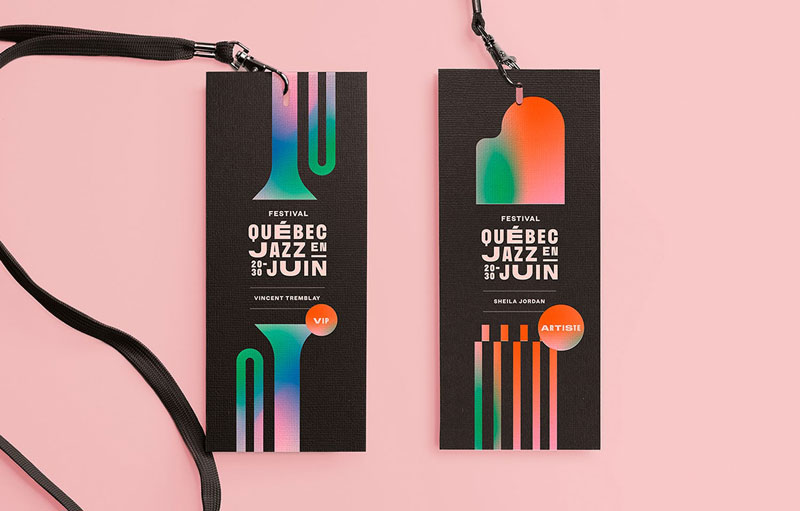
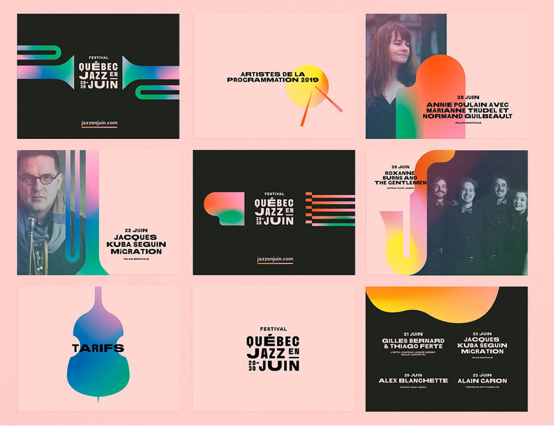
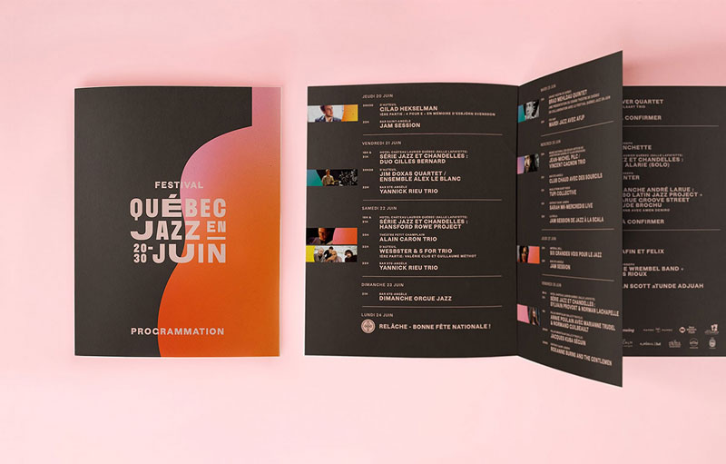
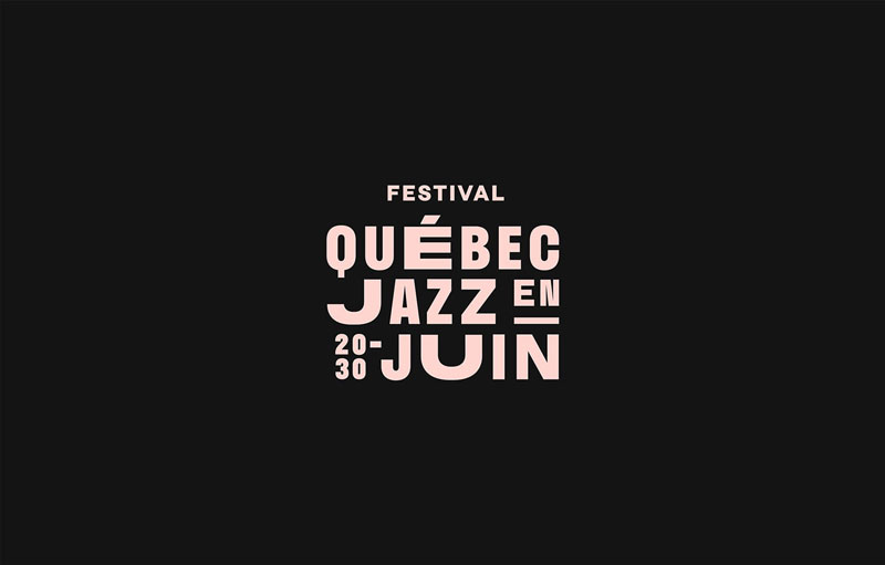
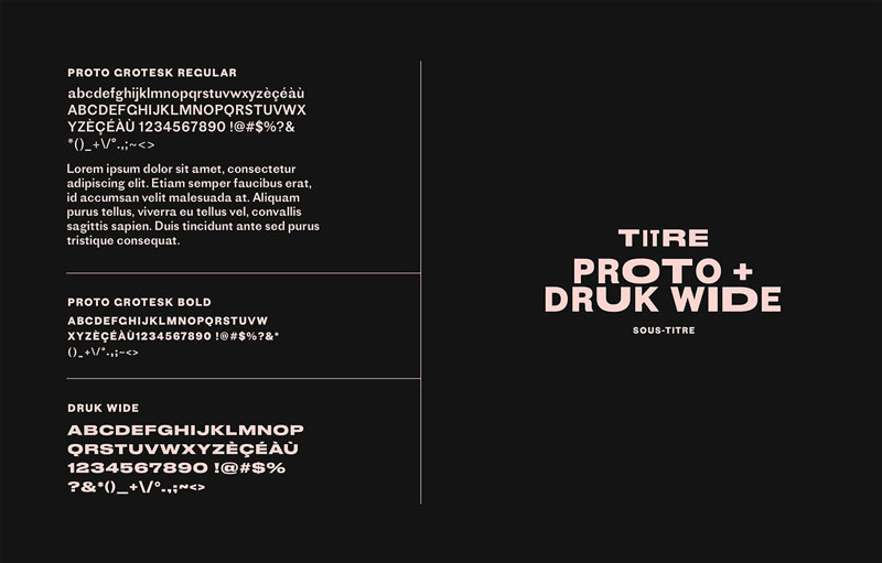
Distorted typography
For the logo part of the identity, the designers did something that your design teachers will not advise, they distorted the letters of the name. By doing it, they created a sense of rythm that is spot on for a jazz festival.
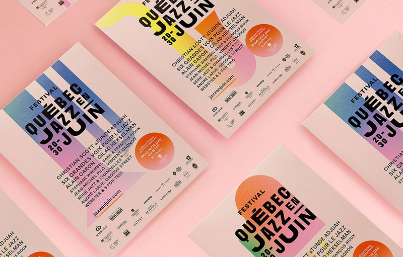
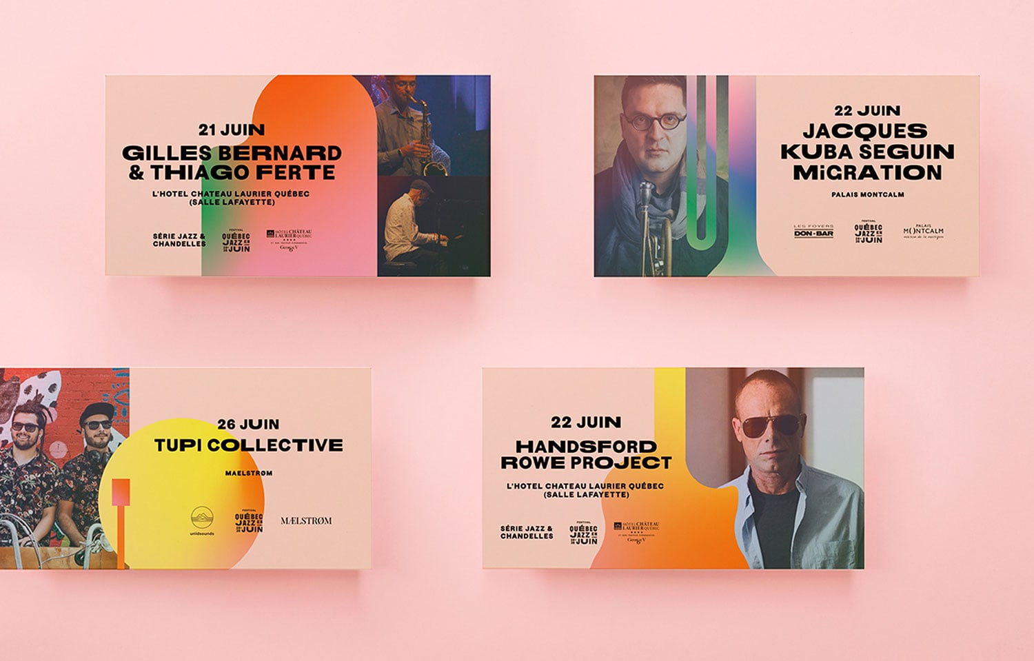
Bright colors
While minimalism and subtle color schemes can look gorgeous, they are not exactly what you need to create a sense of fun and party. The graphics created by MamboMambo didn’t hold on the colors.
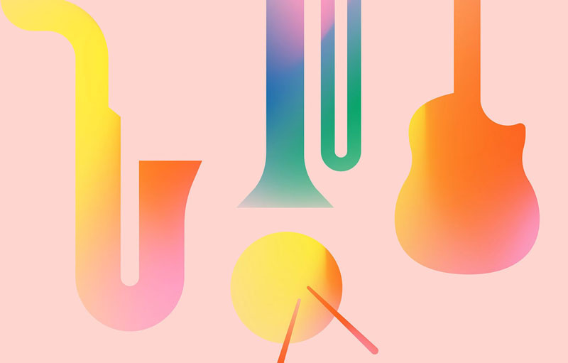
Plain illustrations
The vector-based illustrations are, on the other hand, very minimalistic. Placed on the layouts, they become almost abstract and support the rest of the designs very well.
About the Author

Peter Makeshoff
Peter Makeshoff is the founder and main author of Designer Daily.