
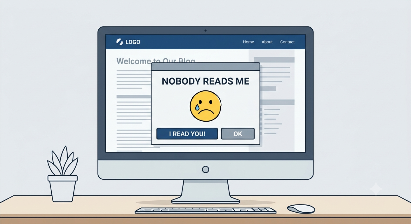
“Are you sure?” is the most ignored question in interface design. Users click through confirmation dialogs without reading them. They are on autopilot, trained to dismiss anything that interrupts their flow. The dialog is a failed communication. It exists to prevent mistakes, but it fails because the user is not listening.
Here is why confirmation dialogs fail and what to do instead.
The Autopilot Problem
Users develop mental models for common interactions. A dialog appears. They click “OK” to make it go away. They do not read the text. They do not evaluate the choice. They do not consider the consequences. They just want to return to their task.
This is not user error. It is human behavior. The brain conserves energy by automating routine decisions. A confirmation dialog is routine. The user treats it as such.
The dialog that nobody reads is not a safety net. It is a performance.
When Confirmation Works
Confirmation dialogs are effective in one specific situation: when the action is rare, irreversible, and high-stakes. Deleting a database. Permanently removing a user. Resetting critical settings. The user has not seen the dialog before. They cannot rely on autopilot. They must read the text to understand what is happening.
Most confirmation dialogs do not meet these conditions. They appear for routine actions that are neither irreversible nor high-stakes. The user has seen the dialog a hundred times. They click through without thinking.
The False Sense of Security
Confirmation dialogs give designers a false sense of security. They assume that a dialog will protect the user. They do not consider that the user might not read it. They do not consider that the user might be on autopilot.
The dialog that nobody reads is not a protection. It is a liability. It allows the designer to feel that they have addressed the risk. It does not actually reduce the risk.
The Alternatives
Undo. The most reliable safety net is the ability to reverse an action. The user makes a mistake. They undo it. The cost of the mistake is low. The user does not need to be warned. They need to be able to recover.
Temporal distance. A delay between the action and its execution. The user schedules a deletion for 24 hours in the future. They can cancel it during that period. The cost of the mistake is low. The user does not need to be warned. They need time to reconsider.
Progressive disclosure. The destructive action is hidden behind a secondary click. The user must first click a “Delete” button, then click a “Confirm” button in a different location. The user is forced to pause. The pause interrupts the autopilot.
Clear labeling. The action should be clearly labeled before the user clicks. “Delete Account” should be labeled as such. “Remove” should be used for removing an item from a list, not for destroying data. The user should know what the button does before they click it.
When to Use a Dialog
Use a confirmation dialog only when:
- The action is irreversible
- The action is high-stakes
- The user has not performed this action before
If any of these conditions is not met, use an alternative.
The Bottom Line
The confirmation dialog that nobody reads is a design failure. It assumes the user will read it. The user does not. It assumes the user will make a thoughtful choice. The user does not. It assumes the user will be protected. The user is not.
The solution is not to make the dialog more prominent. The solution is to design the interface so the dialog is not needed. Undo, temporal distance, progressive disclosure, and clear labeling are more reliable protections.
The user will still make mistakes. They will not read the dialog. Design for that reality.
About the Author

Peter Makeshoff
Peter Makeshoff is the founder and main author of Designer Daily.