Soft drink companies rarely change their products. So, the only way to revive and entice its brand is to redesign the can. Since early 20th century, soft drinks have been a part of world culture that has iconic logos. Today in this blog post, we’ll introduce you through an interesting catalog of the evolution of famous soda can design throughout time.
Whether it’s Coca-Cola, 7Up, Pepsi or Crush, each of these brands have gone through series of packaging evolution that started around 50’s till now. The below given images will clearly justify the evolution and brand progress from earlier packaging design to till today. It’s really surprising to see that the first 7Up actually featured an orange background than the greenish one of today. Also it’s surprising to see that Pepsi or Dr. Pepper were mainly white in the beginning. Check out the evolution of your favorite soft drink below and let us know your view in the comments below!
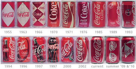
1. Coca-Cola
Have a look at the given picture to see the evolution of Coca-Cola can from 1955 to now.
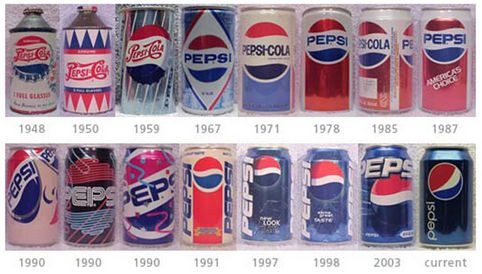
2. Pepsi
Pepsi can was actually white in the beginning. Surprising right?
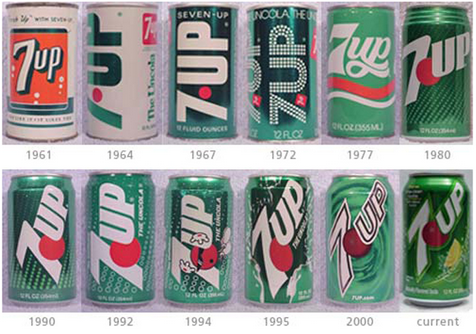
3. 7up
The below given image illustrates the evolution of 7up from 1961 to till now.
4. Dr. Pepper
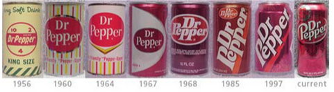
Given picture is the evolution of Dr. Pepper from 1956 to till date.
5. Squirt
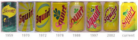
This is an evolution of Squirt from 1959 to current.
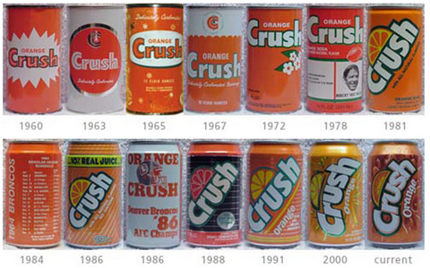
6. Crush
Have a look at the evolution of Crush can from 1960 to till today.