You’ve poured your soul into a product. You’ve crafted a beautiful brand, and your ad campaign is ready to launch. The traffic is coming. But when visitors arrive at your landing page… they leave. The conversion rate is a fraction of what you hoped for.
Sound familiar? This is where art meets science. A high-converting landing page isn’t just a pretty face; it’s a meticulously engineered machine built on principles of psychology, data, and user experience. It’s the science of the sale.
Forget guesswork. Let’s break down the essential principles for optimizing your landing pages to turn visitors into customers.
1. The Golden Rule: One Page, One Goal
Before you write a single line of code or choose a color palette, you must define a single, unambiguous goal for your page. Is it to:
- Sell an e-book?
- Sign up for a webinar?
- Start a free trial?
- Request a demo?
Every single element on your page must serve this goal. If a button, image, or paragraph of text doesn’t directly contribute to that conversion, remove it. Distractions are the enemy of conversion. This singular focus is the foundation of all other optimization.
2. Craft a Killer Value Proposition & Headline
You have less than 5 seconds to answer the user’s fundamental question: “What’s in it for me?”
Your value proposition, typically delivered through your headline and a supporting sub-headline, must be crystal clear, compelling, and benefit-oriented.
- Bad Headline: “Our Powerful SaaS Solution”
- Good Headline: “Save 10 Hours a Week on Social Media Management”
- The Formula: [Achieve Desired Outcome] without [Common Pain Point].
Use clear, direct language. Speak to your user’s pain point and immediately present your solution as the obvious answer.
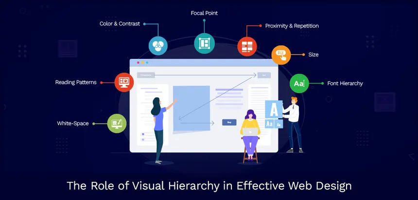
3. The Power of Visual Hierarchy: Guide the Eye
Design isn’t just about aesthetics; it’s about visual communication. Your page should have a clear visual hierarchy that guides the visitor’s eye effortlessly toward your Call to Action (CTA).
- Use size and contrast: Your primary CTA button should be the most prominent visual element on the page.
- Employ whitespace: Ample breathing room around key elements (like your headline, form, and CTA) prevents cognitive overload and draws attention.
- Directional cues: Subtle arrows or even the gaze of a person in an image can direct attention toward your form or CTA button.
Think of your design as a map, with the CTA as the “X” that marks the spot.
4. The Psychology of the Call-to-Action (CTA)
Your CTA button is the climax of your page. Its design and copy are critical.
- Action-Oriented Copy: Ditch generic “Submit.” Use verbs that create urgency and clarity. Think “Get Your Free Ebook,” “Start My Free Trial,” “Reserve Your Spot.”
- Color and Contrast: Your CTA color should stand out starkly from the rest of the page’s color scheme. A/B test colors, sometimes a bold orange or red can outperform a safe blue.
- Placement: Your CTA should be “above the fold” (visible without scrolling) and repeated logically throughout the page as the user scrolls and consumes more information.
5. Build Trust with Social Proof
In the absence of a salesperson, social proof does the talking. It reassures visitors that they’re making a smart, safe decision.
Incorporate these elements strategically:
- Client Logos: “Trusted by [Famous Company]”
- Testimonials: Short, specific quotes about results.
- Case Studies: Links to deeper dives for more considered purchases.
- Ratings & Reviews: Star ratings from third-party sites.
- Security Badges: SSL certificates, payment security logos.
6. The Art of the Scroll: Structuring Your Content
Modern users are adept scrollers. Structure your page to tell a compelling story as they move down.
- The “Above the Fold” Hook: Headline, sub-headline, primary CTA. The essential pitch.
- The “Problem-Agitation-Solution” Scroll: Detail the pain point, agitate its consequences, and present your features as the clear solution.
- The “Proof” Section: Showcase your social proof, testimonials, and data.
- The Final Ask: Repeat your primary CTA with strong, final copy.
Break up text with compelling visuals, icons, and videos to maintain engagement.
7. Embrace the Data: The Unbeatable A/B Test
All these principles are guidelines, but your audience is unique. The only way to know what truly works is to test.
A/B testing (or split testing) is the scientific method applied to your landing page. Create two versions (A and B) that differ by one key element for example, the headline, the CTA copy, or the hero image. Send equal traffic to each and see which one converts better.
Test one variable at a time to get clear, actionable data. The results will often surprise you and are the key to continuous, data-driven improvement.
Your Blueprint for Conversion
A high-converting landing page is a system. It aligns a clear goal with persuasive copy, intuitive design, and social validation, all guided by real-world data. By treating your landing page not as a static brochure but as a dynamic, optimized engine for growth, you transform casual clicks into committed customers.
Now, go apply the science. Your next A/B test is waiting.
About the Author

Peter Makeshoff
Peter Makeshoff is the founder and main author of Designer Daily.