Many elements of website design have become over-familiar and even generic over the past few years. Full-screen images, videos, and hamburger menus are so common that they are seen absolutely everywhere.
Flat design has become a trend and many designers use responsive menus. Creative designers in the industry are beginning to ask, ‘What next?’
What risks are designers willing to take, and how can original and creative ideas be incorporated into UI design? User Interface design involves creativity. By communicating with a client and imagining a new product or goal, a web designer aims to create a unique product. If you are not aiming to create a unique product, it’s easier and quicker to build your site using the right website builder.
Here are some new and creative ideas which are beginning to emerge in website design.
The importance of new design
As a designer, it is very easy to try to improve on old patterns and trends. However, truly innovative design often changes the way a user engages with a product. When Henry Ford created his first car he completely transformed the transport industry.
However, even small changes can make a big difference. Adding a digital element to the household thermostat has made it simple and easy to use. Homeowners can now control the temperatures in their homes from their smartphones. There are no longer complicated keypads to contend with.
Working innovatively while keeping user experience in mind is important within web design too. This is how designers create transformative experiences for their viewers.
The role of wearable technology
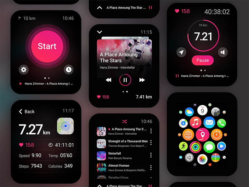
Wearable technology often comes in the form of wrist wear such as a smartwatch, jewelry or even a pair of eyeglasses. Product designers have created an attractive product which appeals to gadget lovers.
Users enjoy this technology and as it starts to become more popular, it is becoming more affordable to a great many people.
As a web/UI designer, wearable technology brings applications and websites not just to smartphones but to watches and other easily accessible devices. Brands will want their sites to be accessible through these products.
Wearable technology means designs need to be as simple and functional as possible, cutting out any superfluous material.
Users love simplicity
When designing a site or web app, keep in mind that a user will often form an opinion in the blink of an eye. As a result, your layout should be simple and clear.
Viewers need to understand the next step to take. As a designer, your goal is to focus your user’s attention immediately. This could mean placing one button instead of four in your layout.
The easier an app or website is to use, the more intuitive it will feel to your viewer. Give your viewers all the information they need without confusing them. Design with the average viewer in mind. You can always add extra content or additional options at a later stage. Keep your pages simple and clutter free.
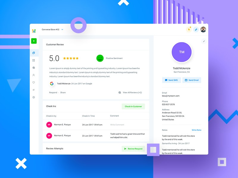
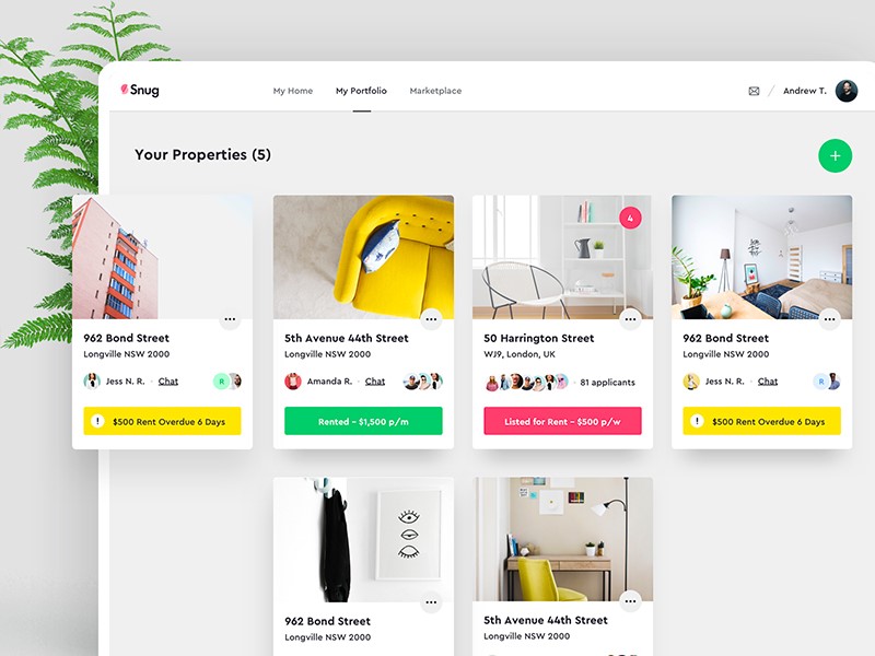
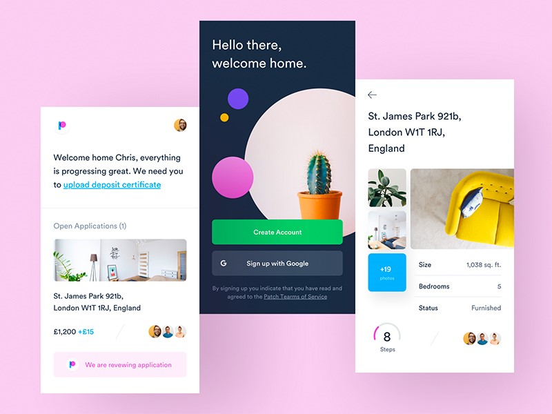
Think of dashboard design as an experiment. What do the most popular dashboards have in common? Simplicity. It should perform the needed tasks for the users, and nothing more.
Balance creativity with convention
Although your goal as a designer is to create a unique design, there are times when it is best to remain traditional.
When you’re creating a digital user interface, it is important to speak your viewer’s language. Your call to action button needs to be easily identifiable.
Likewise, shopping carts and navigation menus need to be familiar to a viewer. Otherwise, your viewer will simply not be able to interact with your site.
Keep responsive design aesthetic
As smartphones and tablets have become increasingly popular, designers have been using responsive design to create websites which adjust to smaller screens.
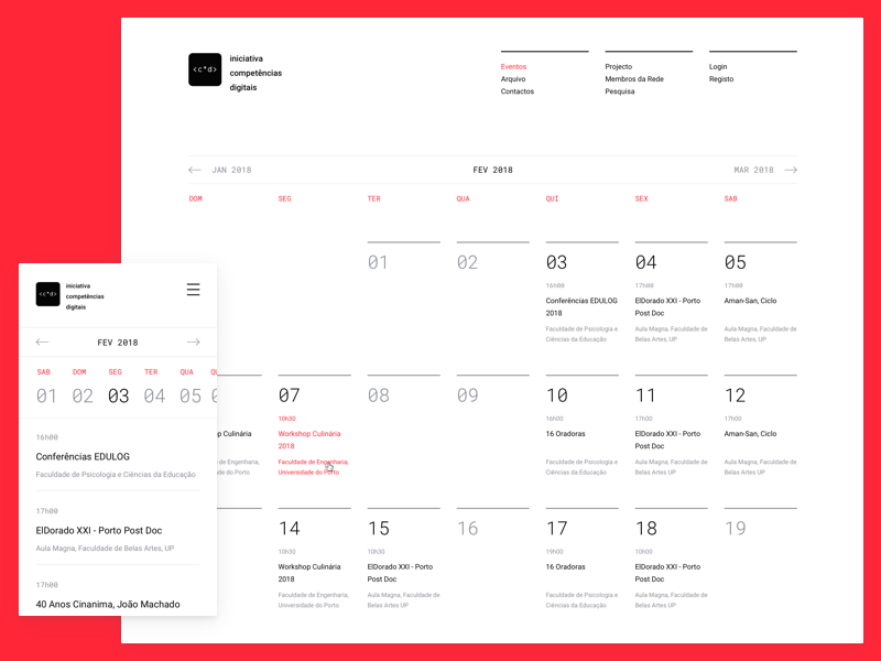
Responsive design has become increasingly popular over the last couple of years. Research proves that it makes a massive difference to viewers.
However, designing a responsive website means taking into account the size of text along with the focus on imagery. If your site simply shrinks in size, it often becomes complicated and difficult to navigate for viewers. Your site might not give the visual message you are aiming for if your imagery is not proportional.
With screen size changing constantly and the increasing popularity of wearable technology, you will want your site to look good in many different screen sizes.
As a designer, your goal is not simply to create a responsive site. It is to create a responsive site which maintains your aesthetic. Check your designs on multiple screen sizes and ask yourself whether it still maintains the image of your brand.
Incorporate animation
An animation is a quick display of images which have been shaped into a sequence. It is commonly used in the form of a film or video. When designers use animation, they increase a viewer’s interaction with the site. Animation gives a fluid sense of life to a site. It attracts users attention as they watch shapes change and evolve.
An animation is an effective way to create interest in any site. As an additional benefit, it does not take a great deal of time to incorporate. Animation enables a designer to bring a message to life. It is, however, not widely incorporated across websites.
Animation can be used in the form of GIF images or saved in CSS or SVG format. You can create anything from a simple underlining of important keywords in a text to a full video or evolving logo which shapes its way across a page.
Adding animation to a website takes very little time. However, your digital interface design will immediately feel less like a website and more like an application.
Make it easy for your user to navigate your web or mobile app
As a UI designer, you need to ensure that your user can engage with your app. This prevents your user from getting lost.
Ensure your app speaks your user’s language and feels intuitive. Navigation should be easily accessible. Your user should be able to do any false actions or find the way home when lost.
If you keep your app design clear, simple and easy to use, this will ensure your users will use it again and again.
Let your user scan your content
Users are often impatient. In order to have your viewers interact and explore your site, you need to make content easy to understand. Your users won’t want to wade through a long and involved story in order to find what they are looking for. Break information up into small chunks. Create headings and subheadings so that your user can see what is on each page.
Place the most important content at the top of your page. An interested user might scroll down to the bottom of a page to read minor details, but you will need to place your crucial content at the top.
Users will only switch from scanning to reading copy when the content helps them to focus on areas of interest. Make your subheadings clear. This way your users can pick and choose what they would like to read.
Many sites use illustrations in order to give quick and easy messages which don’t demand too much of site visitors.
About the Author

Bogdan Sandu
Bogdan is a designer and editor at DesignYourWay. He's reading design books the same way a hamster eats carrots, and talks all the time about trends, best practices and design principles.