We’ve all experienced that moment of low-grade panic. You’re rushing to catch a flight, and the signs for your gate simply vanish. You’re in a multi-story hospital, trying to find the MRI department, and every corridor looks identical. You step out of a subway station in a new city and have no cardinal orientation. This feeling of disorientation is more than just an inconvenience; it’s a failure of the environment to communicate with its inhabitants.
This is where wayfinding design steps in, a discipline that masterfully blends function and form to transform confusion into clarity. It’s the invisible hand that guides us, the silent language that orients us. Far from being an afterthought of simple signage, wayfinding is a holistic system integrated into the very fabric of a space. And at its heart lies a critical, often underrated collaboration: the symbiotic partnership between the architect and the graphic designer.
More Than Just Signs: The Anatomy of a Wayfinding System
Wayfinding is a multi-sensory experience. It leverages color, typography, imagery, lighting, and even texture to create a coherent narrative for a space. A successful system operates on several levels, often subconsciously:
- Orientation: “You are here.” This is the foundational moment of understanding one’s position in relation to the environment. A good system provides constant, subtle reassurance of location.
- Decision Points: “Where do you want to go?” At junctions like corridors, lobbies, elevators, the system must present clear choices.
- Confirmation: “You are on the right path.” This is the continuous feedback that confirms a user’s chosen route is correct, preventing anxiety and backtracking.
This system is woven from many threads: environmental cues like lighting and sightlines, architectural elements like clear pathways and landmarks, and, of course, the tangible graphics, signs, maps, and symbols.
The Architectural Blueprint: Building the Foundation for Navigation
The architect’s role in wayfinding is foundational. Long before the first sign is ever conceived, the spatial design itself can either foster intuitive navigation or create a labyrinth.
An architect thinking about wayfinding will design spaces that have a legible structure. This means creating a clear hierarchy of spaces; a main concourse that feels grand and central, with secondary corridors that are obviously subordinate. They employ visual access, designing open sightlines that allow visitors to see key landmarks or destinations from a distance. Think of being able to see a distinctive staircase or a unique information desk from the entrance, this immediately provides orientation.
Furthermore, architects can design in natural landmarks. A stunning atrium, a unique sculpture, a differently textured floor, or a burst of colored light from a stained-glass window can all serve as powerful, memorable orientation points without a single word. They create “mental maps” in the user’s mind. When an architect designs with navigation as a core principle, they create a canvas upon which the graphic designer can paint a clear, coherent message.
The Graphic Designer’s Palette: Giving Voice to the Space
If the architect builds the body of the space, the graphic designer gives it a voice. Their role is to translate the architectural logic into a visual language that anyone can understand, regardless of language or cultural background.
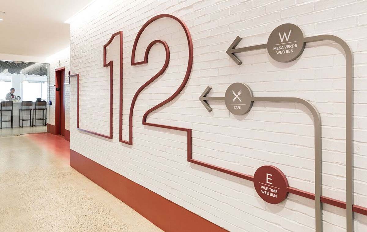
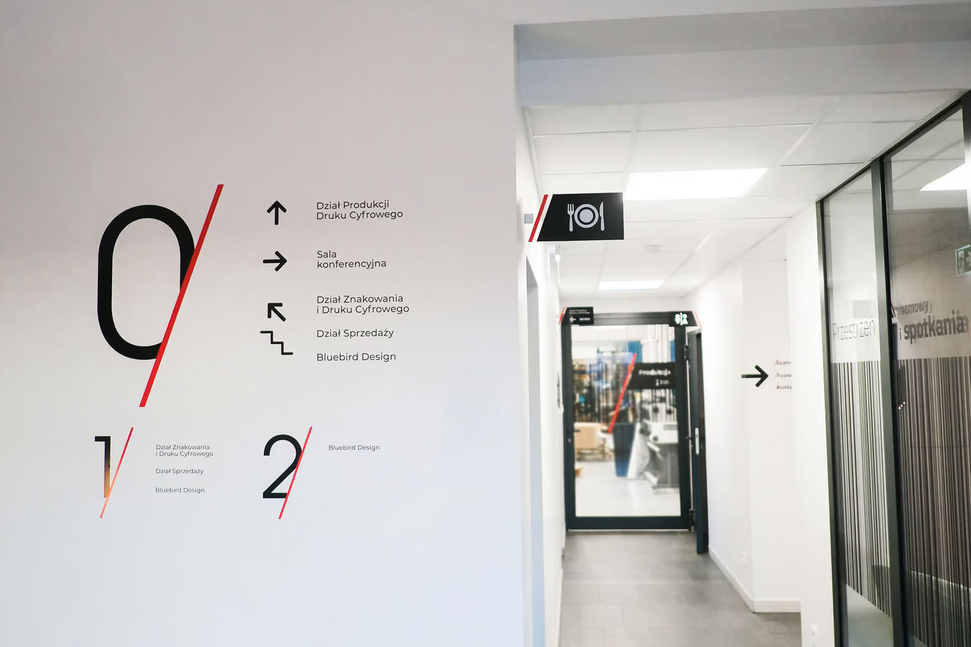
This begins with the development of a visual vocabulary. A cohesive family of typefaces is chosen not just for style, but for supreme legibility from various distances and angles. A color-coding system can be implemented, perhaps all Cardiology departments are signaled with blue accents and signs, while Orthopedics uses green. This allows a visitor to follow a “blue thread” through the building.
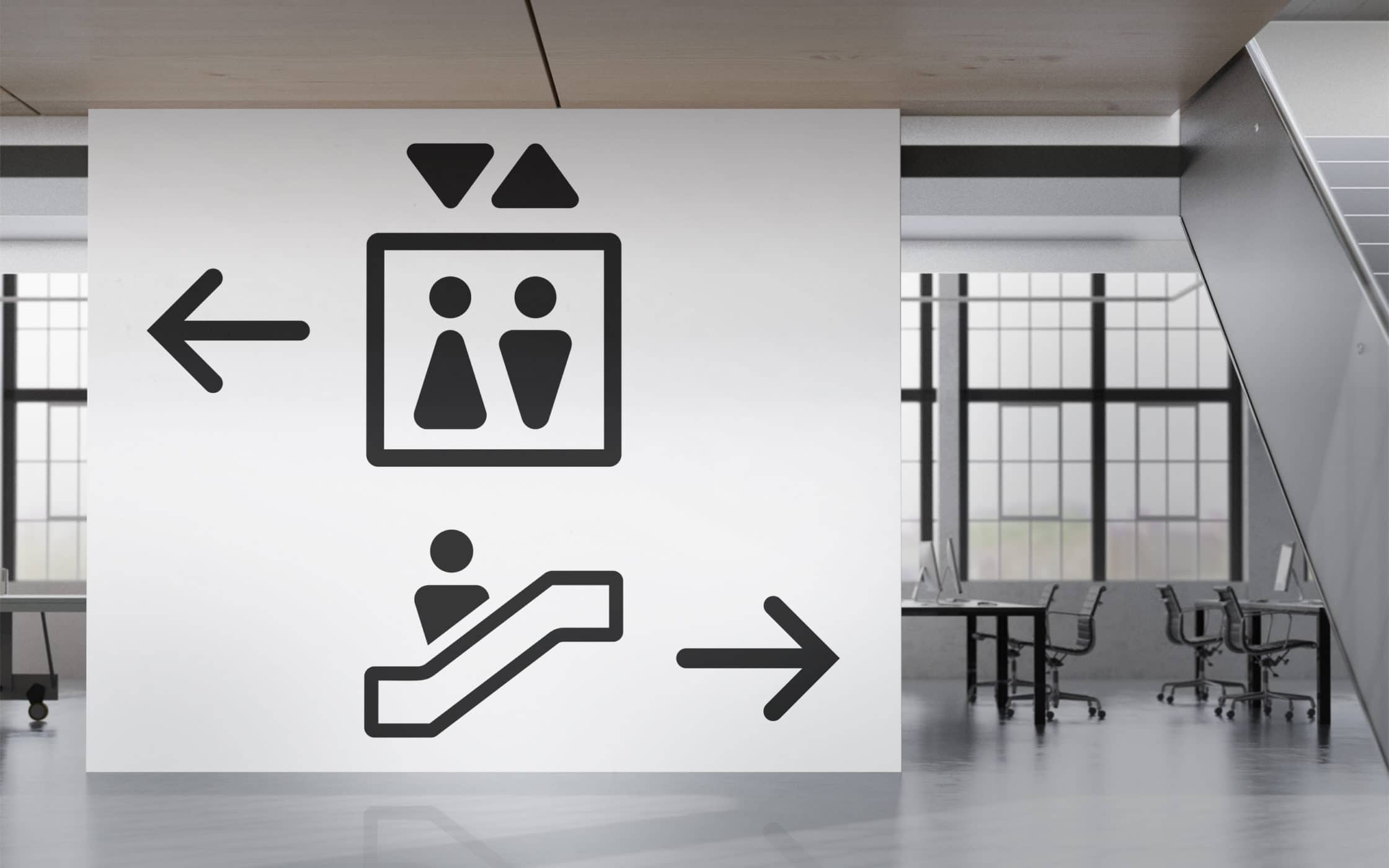
Iconography is another powerful tool. A universally understood icon for a restroom, elevator, or exit transcends language barriers. The graphic designer is also responsible for the hierarchy of information. What is the most critical piece of information a person needs at this specific point? Is it the department name, the room number, or the direction? The design must make this instantly apparent.
Crucially, the graphic designer’s work extends beyond wall-mounted signs. It includes printed maps, digital kiosks, floor graphics, and even the design of the architectural elements themselves, ensuring that a column cladding or a handrail can seamlessly integrate directional information.
The Crucial Collaboration: Where Architecture and Graphics Merge
The most exquisite signage will fail if it’s placed on a confusing floor plan. The most brilliantly laid-out building will still bewilder visitors without clear visual communication. This is why the collaboration between architect and graphic designer cannot be a hand-off; it must be an ongoing dialogue that begins in the earliest stages of a project.
When these two disciplines work in silos, the result is often a “signage salvage job”, trying to fix a fundamentally confusing space by plastering it with signs. This leads to visual clutter, aesthetic dissonance, and a poor user experience.
In a successful collaboration, the graphic designer is brought in during the schematic design phase. They can ask critical questions: Can we widen this corridor to allow for a clear sightline to the information desk? Could this structural column be used as a landmark and host a directional sign? Can the lighting design highlight pathways?
Conversely, the architect can inform the graphic system: We have a low ceiling here, so a hanging sign won’t work. This wall is a key decision point; we need to reserve a large, clear space for a major directional cluster.
A powerful example of this synergy can be found in the world’s best airports, hospitals, and university campuses. At Heathrow Airport’s Terminal 5, for instance, the architecture uses vast, open spaces and clear sightlines to the planes. The graphic design complements this with a minimalist, color-coded system and supergraphic numbers that make gates easily identifiable from a distance. The architecture and graphics tell the same story.
In healthcare, such as the Maggie’s Centres, the collaboration is even more profound. These cancer care centers are designed to be non-institutional and calming. The architecture uses domestic scales, natural materials, and comforting light. The wayfinding often abandons clinical signs altogether, instead using artwork, curated views into gardens, and subtle changes in texture to guide visitors gently, reducing stress in an already anxious environment.
The Ultimate Goal: Style with Substance
Great wayfinding is invisible. When it’s done right, people don’t remark on the beautiful typography or the clever color scheme; they simply move through the space with confidence and ease. They feel empowered, not frustrated. The “style” is not an added veneer; it is the very substance of the communication.
It is a humane and essential design practice. In a hospital, it can reduce patient stress and save medical staff precious time. In a transportation hub, it keeps thousands of people flowing smoothly. In a corporate office, it fosters a sense of place and community.
The next time you effortlessly find your gate, your hospital room, or your lecture hall, take a moment to look around. Notice the harmony between the space and the signs. You are witnessing the quiet, powerful success of a true collaboration, where architects and graphic designers have joined forces not just to build a space, but to give it a voice, guiding you every step of the way with intelligence and, yes, with style.
About the Author

Peter Makeshoff
Peter Makeshoff is the founder and main author of Designer Daily.