A logo is just a shape until it isn’t. The difference between a $500 Fiverr mark and a $100,000 brand identity isn’t just craft, it’s a completely different product. One is a graphic. The other is an asset engineered for legal protection, global scalability, and cultural endurance.
Here’s what actually happens when companies write six-figure checks for branding.
The Anatomy of a Premium Logo Project
When a company pays $100,000 or more for a logo, they aren’t buying a single JPEG. They’re buying a system with five distinct layers.
1. Research and Strategy (Months, Not Hours)
Premium branding starts with zero creative work. Before any pixels move, there’s immersion: stakeholder interviews, competitive audits, market positioning workshops. The Belfast City Council paid £180,000 ($230,000) for its 2008 rebrand, and before any design, consultants conducted 3,000 stakeholder interviews across business, tourism, culture, and community sectors . In a city with a difficult political history, this wasn’t bureaucracy. It was risk management. A logo that alienates one community fails entirely.
2. Global Trademark Clearance (The Legal Moat)
This is the invisible cost that separates professional branding from amateur work. Before a single sketch is approved, trademark attorneys conduct exhaustive clearance searches across federal databases, state registries, common law use, domain names, and international jurisdictions . For a brand with global ambitions, this means searching the USPTO, EUIPO, WIPO, and key markets like China and Japan.
Why does this matter? NBC learned the hard way in 1976. They paid Lippincott $750,000–$1 million for a new logo, only to discover it was nearly identical to the Nebraska Educational Television logo. The resulting lawsuit cost NBC $800,000 in equipment donations and $55,000 in legal fees, plus the cost of yet another redesign . A clearance search would have cost a fraction of that.
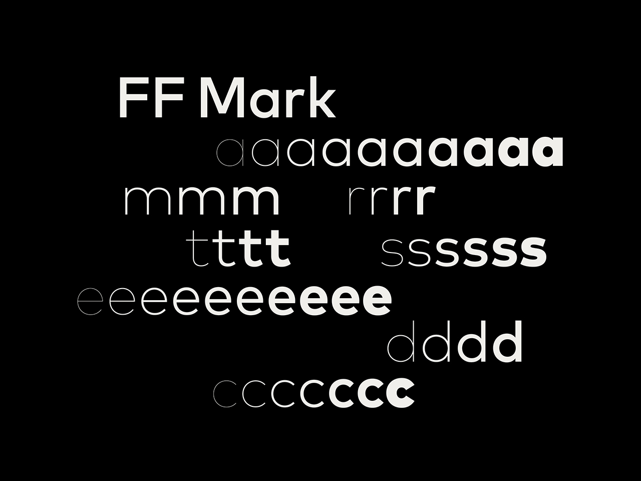
3. Custom Typography (Own the Alphabet)
Off-the-shelf fonts can’t be trademarked. Custom lettering can. When Mastercard commissioned a custom typeface from a prestigious foundry like Hoefler & Co., pricing for a four-style family with temporary exclusivity ranges from $100,000 to $250,000 . A full custom typeface from a top-tier foundry like Dalton Maag might run $20,000–$25,000 per weight, with permanent exclusivity doubling that figure .
What does this buy? A typeface that belongs exclusively to the brand. No competitor can use it. No free font website offers a knockoff. The brand owns the alphabet it uses to speak to the world.
4. Comprehensive System Design
A six-figure logo project doesn’t deliver a single mark. It delivers a toolkit:
- Primary, secondary, and tertiary logo lockups
- Icon and favicon versions
- Clear space rules and minimum sizes
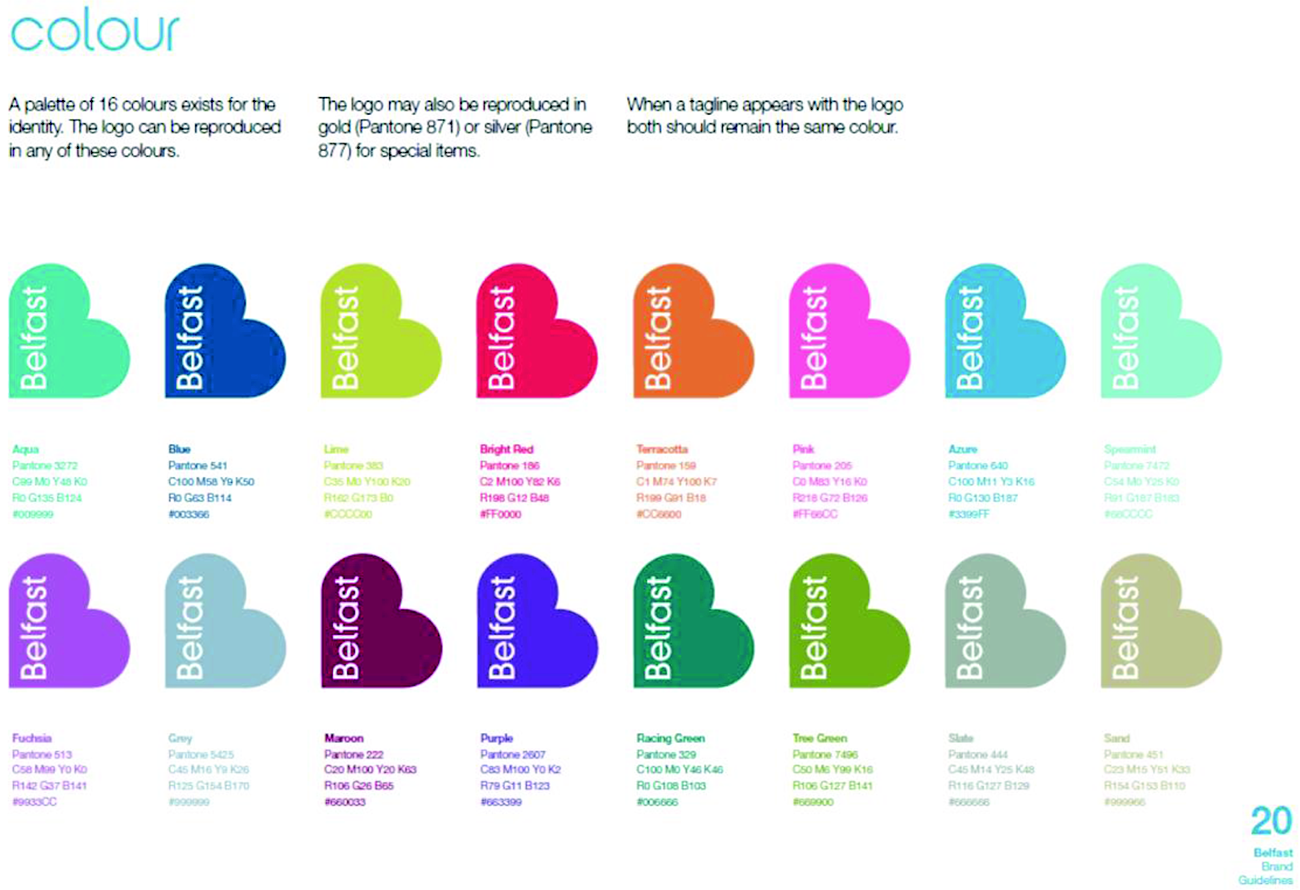
- Color palettes with light and dark mode variants
- Motion guidelines for digital applications
- Application across packaging, signage, uniforms, and digital interfaces
The 2024 Pepsi rebrand, which returned to a retro-inspired mark with pulsating animation, was part of a broader strategy to appeal to Gen Z after years of declining soda sales . The logo alone didn’t solve that problem. The system around it did.
5. Long-Term Scalability and Governance
Premium branding includes the infrastructure to maintain consistency across hundreds of touchpoints and dozens of markets. This means brand guidelines that function as living documents, component libraries, and training for internal teams. The BP rebrand by Landor Associates cost £1.36 billion overall, and included training 1,400 “brand champions” across 19 countries to ensure the new identity was implemented consistently .
Case Study: Pepsi’s $1 Million Logo (The One Everyone Mocks)
The 2008 Pepsi rebrand is the most famous six-figure logo in history, not because it was successful, but because the 27-page rationale document leaked . The Arnell Group’s justification referenced the golden ratio, the Mona Lisa, Descartes’ coordinate system, and “the gravitational pull of Pepsi.”
The result? A minimal adjustment to the white center stripe. The internet laughed.
But here’s what the memes miss: that logo lasted 14 years. It appeared on billions of cans, stadium signage, and Super Bowl ads. In October 2008, two months after the redesign, Pepsi reported disappointing earnings and laid off 3,300 workers, not because of the logo, but because of the broader economy . The brand persisted.
Pepsi’s 2024 rebrand returned to a retro look, leaning into Gen Z nostalgia. The cost of the new identity wasn’t disclosed, but it followed the same premium model: custom typography, motion integration, and a system designed for global rollout .
What the Money Actually Buys
When a company pays six figures for a logo, the deliverable isn’t a file. It’s peace of mind:
- Legal certainty. Clear trademark clearance means no cease-and-desist letters arriving six months after launch.
- Exclusivity. Custom typography ensures no competitor can use the same visual language.
- Scalability. A system that works on a business card and a billboard, in print and on screen, in London and Shanghai.
- Longevity. Work that doesn’t look dated in 18 months because it was built on strategy, not trend.
Is It Worth It?
For a small business with local reach? Probably not. A $6,000–$8,000 brand identity from an experienced designer delivers exceptional value . For a multinational corporation, the calculus is different. A logo appears on billions of touchpoints. A misstep, legal, cultural, or strategic, costs exponentially more than the design itself.
BP’s 2000 rebrand cost £1.36 billion and was mocked by environmental groups. But the internal goal wasn’t public perception. It was aligning 97% of employees with a new corporate direction . By that measure, it worked.
Premium logo design isn’t about making something beautiful. It’s about making something bulletproof. That’s what companies are buying, and why they’ll keep paying six figures for marks that, to the untrained eye, look “simple.”
About the Author

Peter Makeshoff
Peter Makeshoff is the founder and main author of Designer Daily.