What’s the first thing that comes to mind when you think of equestrian sports? Probably, luxury, heritage, and class. Well, that’s not coincidental. It was purposefully built just to attract high-class individuals and money.
But how did equestrian sports managed to create that luxury feel around them? Well, this has been done for decades, and it is not an overnight story. The good thing is that you can use equestrian inspired designs and symbols to elevate your brand and make it feel more premium and expensive.
Have you ever seen a tiny horse bit on a loafer and thought, “How expensive is that?”, well, welcome to the club. Equestrian cues, and we are talking about bits, buckles, reins, knights, all signal heritage, control, class, craft, making products more desirable.
In other words, these elements whisper, “hey, we’ve been doing this for a long time”, in a subtle way without shouting. And this is perfect since we live in an era where “quiet luxury” is trending. The question is, how can you use this in your advantage and make your brand more desirable?
Why Do Horse Codes Work?
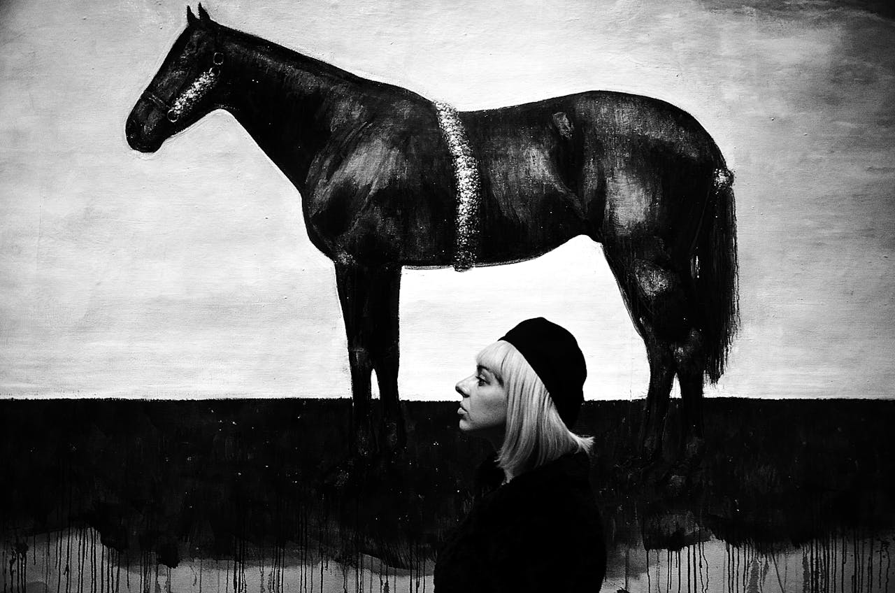
When you think of horses, they represent power under discipline and that’s exactly what great brands promise. They are all about strength but refined; speed, but steered, and premium feel by being handcrafted.
Equestrian designs give you built-in storytelling (stables, saddlery, heritage, dynasties, etc.) as well as built-in tactility (leather, metal, stitching).
When you look at most equestrian brands, you’ll start to notice patterns. They are all too simple to a point where the simplicity is translated into elegance. These brands are more focused on elevating the feel and function of a product, rather than to innovate and introduce something new.
Today’s market still rewards restraint and craft, even amid some backlash to the buzzword version of “quiet luxury”. In other words, heritage cues done with a bit of class and taste are safe ground. They can only make your brand feel more luxurious, older, and more trustworthy.
Equine Branding Examples
Have you ever thought to yourself, why most expensive and luxury brands have a horse in their logo? Well, there is a deeper story to that. Let’s see some examples:
Hermès: craftsmanship first, logo second.
Hermès didn’t invent an equestrian story; the brand itself is a story. The house began in 1837 as a Paris harness workshop, and it still places saddlery craft at the center of its identity.
That’s why buckles, bits, and strap forms never feel forced; they are literally house codes. So, if you want to master authenticity, you should start here.
Gucci: the horsebit as a “logo without words.”
The Gucci horsebit loafers arrived in 1953 and turned a piece of tack into one of fashion’s most recognizable signatures. The horsebit element works on everything: shoes, hardware, prints, and even type lockups. It is instantly recognizable, scalable, and feels premium.
Why? Well, brands target equestrian sports for a reason. They want to literally get on the horseback and get some of that premium feel.
I guarantee you that if you attend an event like the Breeders’ Cup, you’ll definitely see a lot of people wearing Gucci horsebit loafers, especially in the expensive areas. That’s the vibe of a race. It will also inspire you to place a bet, but make sure to check the live Breeders’ Cup odds before making any decision.
Burberry: heritage, refreshed.
Under Daniel Lee, Burberry brought back its Equestrian Knight Device and wove it through products, stores, and brand activations. It’s a neat example of how to modernize a historic emblem: edit the detailing, control the placement, and let it behave like jewelry, not a billboard.
Timekeepers and trophies: Longines & Rolex.
Longines has spent years timing elite equestrian sport across show jumping, eventing, dressage, and flat racing, rooting its identity in measured precision. Rolex, meanwhile, underwrites the Rolex Grand Slam of Show Jumping, positioning its crown right where discipline meets drama. If you can partner where your brand promise is tested, it reads as truth, not theater.
You can Borrow These Codes
Start with the feeling you want to bottle. Is it elegant control (dressage), athletic power (eventing), or clubby heritage (polo)? Pick one object that expresses it, a snaffle bit, a stirrup, a ring, a clean horse head profile, and draw it with the care you’d give a wordmark. Keep the form bold and readable at 16×16 (favicons and social avatars are ruthless editors).
Tuck it into your system as a primary icon, then let cropped details become pattern, hardware, buttons, and tiny UI touches. If it starts to look like clip art, you’ve gone too literal, pull back to abstraction.
Make it Feel Expensive (even on a budget)
Luxury lives in the details, not the number of graphics. In print, consider heavier, uncoated stock with a blind emboss of your emblem. In packaging, repeat a single metal finish across closures and foils so the brand feels coherent in the hand. In digital design, use restraint with reference craft: micro-emboss shadows, subtle stitch-like dividers, and button “hardware” that clicks with a soft, damped motion instead of a loud bounce. The goal is to evoke saddlery precision, not cosplay a saddle.
Color tells the story before type does. Think cognac, oxblood, deep navy, racing green, tobacco, punctuated by one “silk scarf” bright if you need seasonal energy. Typography should have backbone: either a confident serif with crisp contrast or a disciplined grotesque with steady rhythm. Give it space to “breathe,” like reins kept just taut enough.
So, with the right tweaks, you can make your brand look and feel more prestigious. You don’t have to invent anything. Just copy what big brands have been doing for decades.
About the Author

Peter Makeshoff
Peter Makeshoff is the founder and main author of Designer Daily.