
It’s not an easy task to redesign a successful and loved brand like Firefox. With millions of users and thousands of people involved in the development of the browser, the attachment to the cute fox (which is actually a red panda) swirling around the world is much bigger than it would be for a regular tech corporation. Many companies have launched failed redesigns and paid a heavy price for it.
A Necessary Move
Despite all this love for the old branding, a new design was definitely needed. In fact, Firefox is not what it used to be anymore. Beyond a browser, it became a suite of products: Firefox Send to send large files safely, Firefox Monitor to know if your email was part of a data breach, Firefox Lockwise to protect your devices passwords, and of course Firefox Browser, to read Designer Daily (and other websites).
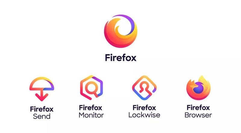
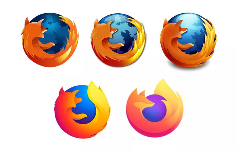
The design process went for the creation of a parent brand to encompass all these products while keeping the fox elements. The fox is still there, but only showing its tails, and the designers decided to emphasize the swirl movement, which seems to be a great idea.
The Firefox Browser logo also evolved a little to match the new branding’s illustrative style and colors. It does, however, contrast too strongly with the logos created for the other products, making it look like they are not part of the same product family.
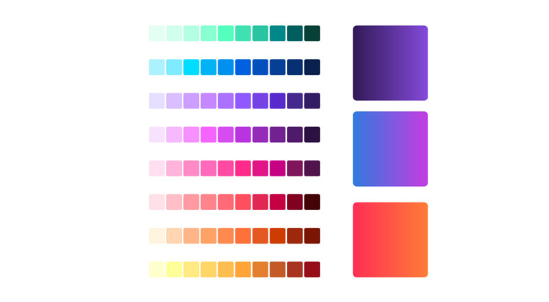
New Color Scheme
The new color scheme looks pretty much like a rainbow and makes heavy use of gradients.
Graphic Elements
A set of graphic elements gives room for designers to play with.

Illustrations
Many playful illustrations were created. The color scheme is spot-on for creating a lively atmosphere and a friendly look-and-feel.

Typeface
The typeface used for the logo system was also modernized, more rounded and sharp.

About the Author

Peter Makeshoff
Peter Makeshoff is the founder and main author of Designer Daily.