Imagine landing on a webpage and your eyes light up like a kid in a candy store. That’s the power of killer web design, right there. I’m talking about eye-catching websites that snatch your attention and refuse to let go. We live in a digital world where a site’s look can make or break a business. Dull just doesn’t cut it anymore.
Here’s the deal: a website’s gotta pop! It has to speak your language, groove with your brand, and deliver the goods all while looking sharp. That’s where I step in. I craft spaces on the internet where beauty and brains collide, ensuring every pixel is on point and every user click pays off.
By the time you’re done here, you’ll have the inside scoop on creating vibrant, visually appealing web design with that “wow” factor that hooks visitors.
I’ll unpack the secrets to engaging user experience, slick website navigation, and those game-changing interactive website features.
The Power of First Impressions
You know when you meet someone and in like, 5 seconds, you decide if you’re vibing with them or not? Websites are kinda the same. This is why interactive websites keep users entertained and longer on their pages.
The role of website design in user engagement
Users decide in a split second whether they’re into your website or not. The design? It’s the handshake, the smile, the “Hey, how you doing?” of the digital world.
Websites that capture attention are not just visually appealing; they speak to the user, like “Hey! I’ve got what you need.” Incorporating a product carousel can add that dynamic element that keeps users engaged and browsing through your products.
Statistics on user retention based on website aesthetics
Let’s geek out on some facts for a sec. Did you know that users form an opinion about your website in 0.05 seconds? Yep, faster than you can say “eye-catching websites.”
And if they’re not impressed, 38% of folks won’t even bother engaging with your content. The design is the main factor affecting trust for 48% of users. Yikes, right?
But also, kind of exciting because it means there’s so much room to impress.
Essential Elements of Eye-Catching Design
Minimalistic Approach
The significance of a clutter-free homepage
Let’s kick things off with a truth bomb: less is more. Ever been to a website where there’s so much going on, and you’re like, “Whoa, slow down!”? That’s a cluttered mess, my friend. The homepage of eye-catching websites should be like your favorite coffee shop – inviting, warm, and without a gazillion things fighting for your attention. Learn about the importance of minimalism in web design here.
Benefits of a clean design
- Super speedy: Clean designs tend to load faster. Nobody’s got time for those prehistoric loading times, right?
- Screams professional: Think of it as the difference between wearing a tailored suit and one you just picked off a random store rack.
- Focus, focus, focus: It guides your visitors to what’s important. Like that shiny ‘Buy Now’ or ‘Learn More’ button.
Seamless Navigation
Importance of user-friendly navigation
Imagine walking into a giant mall with no signs. Lost? Frustrated? That’s what bad navigation feels like on a website. The key? Keep it simple. Your visitors should slide through your pages like butter on a hot pan. Check out these innovative website menu designs for inspiration.
Tips for enhancing website navigability
- Clear Call to Action (CTA): Think of CTAs as the shiny objects guiding your users. “Want to know more? Click here.”
- Breadcrumb trails: No, not real bread. But these lil’ trail guides show users where they are and how to get back.
Visual Hierarchy and Content Placement
Definition and importance of visual hierarchy
Visual hierarchy is like the VIP list of your content. It’s all about arranging elements in a way that shows their order of importance. It’s like giving the main band (your primary content) the biggest stage, while the opening acts (secondary content) get the smaller ones. It ensures the rockstars on your site get all the limelight they deserve. Discover how to effectively use website visuals to guide user attention.
Techniques to guide users’ attention
- Contrast: Bold versus light. Big versus small. Black versus white. Play around!
- Directional cues: These are sneaky. Arrows, images looking in a certain direction, lines… they all subtly guide a viewer’s gaze.
Keyword-Focused Headlines
The role of SEO in web design
Alright, here’s where things get spicy. SEO isn’t just about cramming keywords into your content. It’s about crafting a design where those keywords shine. Think of your website as a stage, and SEO as the spotlight. You want that spotlight on your star performer, the keyword.
Crafting effective, SEO-friendly headlines
- Be natural: Nobody likes a try-hard. Your keywords should fit into your headlines like they’ve always been there.
- Front-load: Put your main keyword closer to the beginning of your headline. It’s like putting the star of the show front and center.
Mobile Optimization
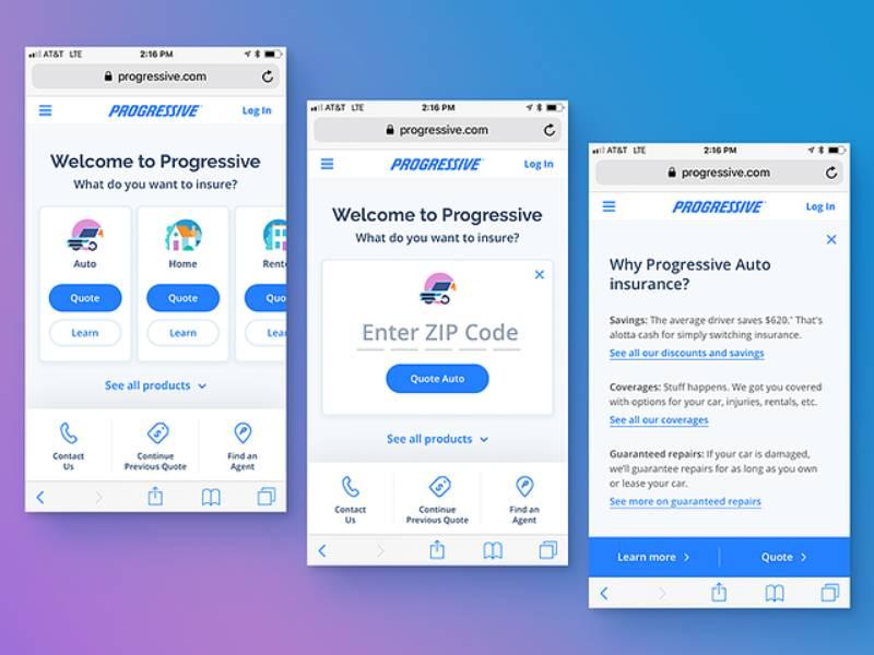
The rise of mobile browsing
Raise your hand if you’re reading this on your phone. Okay, I can’t see your hands, but I bet a bunch of you are. With more folks surfing the web on their mobiles than ever, if your site isn’t optimized for mobile, it’s like hosting a pool party but forgetting the pool.
Tips for a mobile-friendly website
- Responsive design: Your site should look dashing, whether it’s on a desktop, tablet, or phone.
- Big buttons: Fat thumbs are real. Give ’em big buttons to tap on.
Advanced Design Techniques
Use of Vibrant Colors
Psychological impact of colors on users
Color is like the secret sauce of eye-catching websites. Ever walked into a room and felt an instant vibe? That’s what colors do. They can pump you up, chill you out, or make you go “Hmm, intriguing.” For instance:
- Red shouts ‘Look at me!’ It’s the adrenaline junkie of colors, all about passion and urgency.
- Blue, on the flip side, is your Zen yoga instructor, transmitting trust and calmness.
So, when you’re picking colors, you’re not just decorating; you’re straight-up mind-bending.
Tips for choosing a harmonious color palette
- Nature is your BFF: You ever see the sky clash with the trees? Nope. Mother Nature’s got her palette game on point.
- Stick to 60-30-10: This ain’t some secret code. It’s a golden ratio. 60% dominant color, 30% secondary, and 10% for that zingy accent.
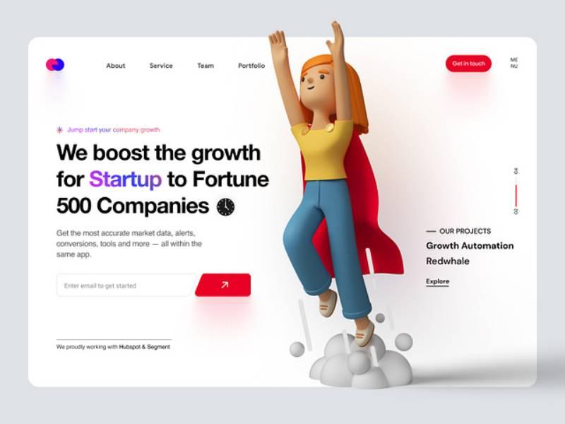
Incorporation of 3D Graphics and Animations
The trend of 3D graphics in modern web design
3D graphics are like the latest kicks everyone wants. They add depth, literally and figuratively, making eye-catching websites pop off the screen. It’s no longer just about flat images; with 3D, it’s about drawing folks into a whole new dimension. It’s like inviting them from watching a play to stepping onto the stage.
Benefits of interactive animations
- Engagement boost: People love stuff they can poke and prod. An animated button or a floating icon? It’s like a digital fidget toy.
- Narrative gold: Animations can tell a story, lead a user through a journey, or simply make them smile.
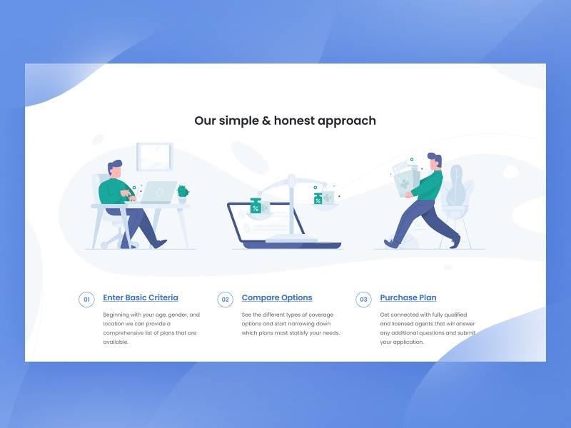
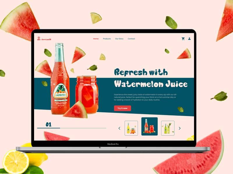
Custom Illustrations and Graphics
The uniqueness of custom visuals
Generic stock photos? Meh. Custom illustrations? Heck yes! Custom visuals are like getting a tattoo instead of slapping on a sticker. They tell the world, “This is what we’re about!” and give a distinctive flair that sets eye-catching websites apart.
Impact of illustrations on brand identity
- Instant recognition: Think of it like seeing your friend’s unique doodle and knowing it’s theirs without a doubt.
- Emotional connection: A custom illustration can convey feelings, vibes, and energy in a way words sometimes just can’t.
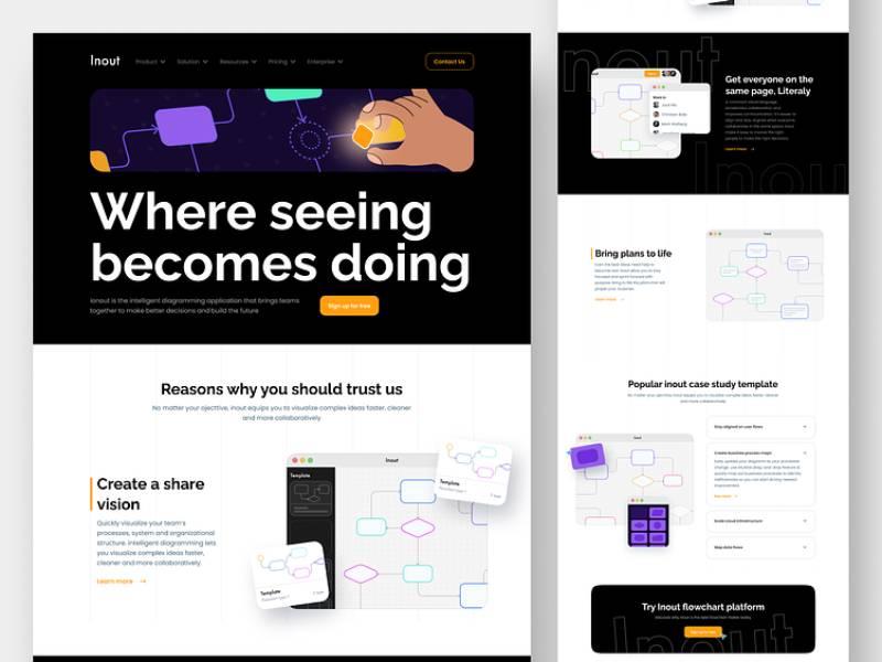
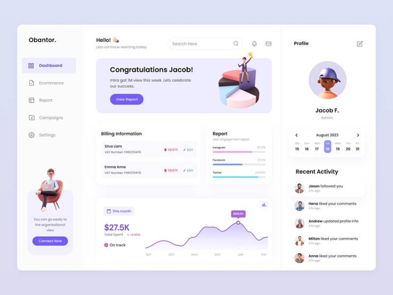
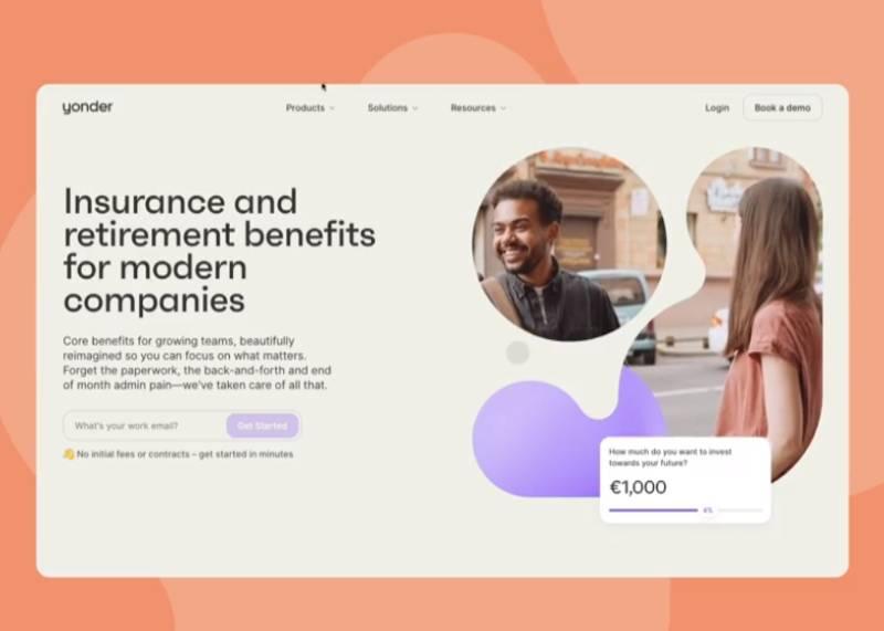
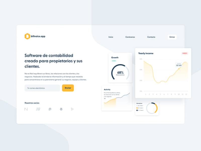
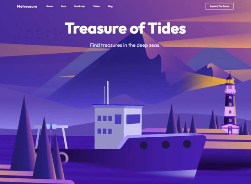
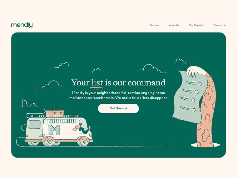
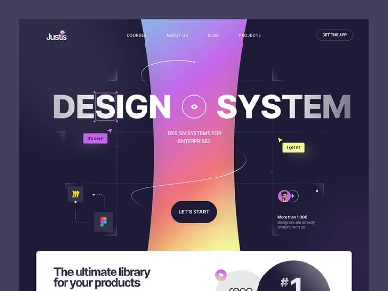
Real-world Examples of Eye-Catching Websites
Brief analysis of award-winning website designs
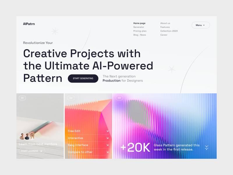
Diving into the digital ocean, there are some websites that make you stop and think, “Whoa, what sorcery is this?!” These are the eye-catching websites that snag awards and have us ordinary folks drooling. For more about creating captivating designs, explore these creative storytelling websites.
Key takeaways from each example
- Stay Fresh: New trends, like parallax scrolling, can make a website feel fresh out of the oven.
- Colors can be Game-Changers: A daring palette can amp up the energy levels of your site.
- Tell a Tale: If your brand has a story, flaunt it. It’s not bragging if it’s captivating.
Common Mistakes to Avoid
Dude, while some sites are smashing it, others… well, they trip and faceplant. Why? Some typical boo-boos.
Overloading with information
It’s like walking into someone’s room and seeing clothes, books, and yesterday’s pizza all over. Too much info is clutter. People don’t know where to look, and before you know it, they’ve bounced. Peace out. Keep it clean, folks.
Inconsistent design elements
Imagine wearing stripes, polka dots, and neon all at once. Cool for a circus, not so much for eye-catching websites. Inconsistency makes your site look messy, and users feel lost. Remember, simplicity is key.
Ignoring mobile optimization
Hey, it’s 2024! Most peeps are on their phones, swiping away. If your site looks wonky on mobile, it’s like showing up to a beach party in a winter coat. Not cool. Get with the times, optimize for mobile, and make sure your site looks fab on all devices.
FAQ about eye catching websites
What instantly makes a website eye-catching?
It’s a combo move. Think bold color schemes and crisp, high-quality images. Mix in some interactive elements with some JS animation for good measure, and boom—you’ve got a site that’s a real looker. User-friendly interface seals the deal; it’s like that charismatic person you just can’t ignore.
How important is mobile responsiveness for an eye-catching website?
Mobile responsiveness? Non-negotiable. A site that snuggles comfortably on any device is like a favorite pair of jeans—just feels right. Remember, most folks are browsing on the go, so your site needs to shine on small screens too.
Can you have too much going on in a website design?
Absolutely. Like a fireworks show, it’s stunning but overdo it and it’s just noise. Striking that balance — critical. You want that user-friendly UI to guide visitors, not leave them feeling like they’ve walked into a maze with no cheese at the end.
What role do fonts play in making a website pop?
Fonts are the unsung heroes of design. Choose wisely and they’re like your site’s voice, setting the tone. Too many? It’s chaos. The right one? It can be as compelling as a perfectly delivered punchline.
Should you follow design trends for creating an eye-catching website?
Sure, trends are a good starting block—gets the creative juices flowing. But you can’t just chase them. The real trick? Balancing modern website aesthetics with timeless design. That way, your site’s looking sharp without feeling dated faster than you can say “What’s the new black?”
How do colors impact the attractiveness of a website?
Colors whisper to the subconscious. They’re mood-setters. Hit the right palette and visitors feel it, like the vibe of a chill lounge. It’s about harmony, emotion, and sometimes, a little psychology. Too little, and it’s bland. Too much, and well, it’s a circus.
What are some key features of an engaging user experience on a website?
It’s gotta flow like a great conversation. Intuitive navigation, snappy load times, and interactive website features that keep users intrigued. It’s the difference between a guest staying for dessert or bailing before the appetizers.
How often should a website be updated to keep it eye-catching?
Keep it fresh. Regular updates shout that you’re alive and kicking. But it’s not just about frequency; it’s about quality updates. Revise content, sprinkle some new design elements, and check if those SEO techniques are still playing nice with Mr. Google.
Do animations and videos make a website more appealing?
When done right, videos and animations are like eye candy—they’re dynamic, tell a story fast, and engage like no tomorrow. Just make sure they serve a purpose, like showing off a product or breaking down complex stuff, otherwise, they’re just fluff.
How can I measure if my website is truly eye-catching?
It’s not all in the looks. Dive into metrics like bounce rates, time-on-page, and conversion rates. These numbers are like a real-time review of your website’s “curb appeal.” Couple that with user feedback, and you’re getting the whole picture.
Conclusion
Alright, let’s wrap this up. You’ve seen some pretty slick eye-catching websites examples by now. The kind that make your heart beat a tad faster and your fingers itch to explore every corner. That’s the magic of stellar visuals meeting top-notch functionality.
- Brilliant hues that pop off the screen? Check.
- Imagery so sharp you’d think it’s 8K? Got ’em.
- Navigation smoother than a buttered-up slip ‘n slide? You bet.
Each example we walked through is proof that attractive web graphics and engaging user experience aren’t just buzzwords; they’re the real MVPs behind the screens.
Taking these inspirations forward, remember the core idea: blend visually appealing web design with intuitive usability. Spark emotions with colorful website themes, but also guide visitors effortlessly. It’s like being a tour guide in a stunning museum—show them the beauty, minus the confusion.
There you have it. The deets on creating sites that not only catch the eye but enamor the soul. Happy designing, and may your websites always be as eye-catching as a supernova in the dark night sky.
About the Author

Bogdan Sandu
Bogdan is a designer and editor at DesignYourWay. He's reading design books the same way a hamster eats carrots, and talks all the time about trends, best practices and design principles.