A restaurant’s identity isn’t a logo. It’s a thousand small decisions that add up to a feeling. The weight of the menu paper. The font on the takeout bag. The color of the aprons. Each element alone is small. Together, they tell you whether this place is for you.
Here’s how successful restaurants create cohesive experiences across dozens of touchpoints.
The Challenge of Scale
Restaurant branding is uniquely complex. Unlike a product on a shelf, a restaurant exists everywhere at once. Inside: menus, uniforms, tableware, lighting. Outside: signage, window displays, patio seating. Online: websites, delivery apps, social media. And increasingly, takeout packaging travels into customers’ homes, becoming a mobile advertisement.
The brands that succeed treat all these elements as one system. They don’t design a menu and figure out the website later.
Case Study: Massi’s – Memory as Material
When Saint-Urbain took on Massi’s, an Italian sandwich shop in Queens, they had almost nothing to work with. Just a faint childhood memory of red hand-drawn lettering and mysterious yellow illustrations of faces and horses.
Those yellow figures became the key. They were characters from Scopa, a traditional Italian card game. This became the visual language for the entire identity. Hand-drawn illustrations referencing the suits and symbols of Scopa appear across merchandise, uniforms, signage, and collateral. A custom wordmark draws from classic Italian deli typography. Warm reds and yellows evoke tomato paste and bread bags.
The result feels handmade but precise. As founder Alex Ostroff puts it: “The brand needed to mirror that level of care and confidence, while still keeping things light and local”.
Case Study: One&All – Diversity as System
When Without Studio took on Sodexo’s US college dining operations, they faced a staggering challenge: 350+ campuses feeding over a million people daily, each with its own culture and colors.
The answer was One&All, built on “commonality in diversity.” The visual system uses familiar collegiate cues (varsity fonts, bold stripes) but applies them flexibly. Two illustrated mascots, “One” and “All,” front the brand, one soft and circular, the other angular. Their banter across signage and social media mirrors the diversity of any campus.
The color palette is genius: after auditing existing university colors, they settled on rhubarb pink, a hue no college had claimed but one that pairs well with nearly everything. “The color is surprisingly sociable,” the strategy director notes.
Typography contrasts bold varsity lettering with expressive script. A “fixed-and-flex” model keeps core assets consistent while allowing regional variations. This matters deeply when color choices can be politically loaded between rival colleges.
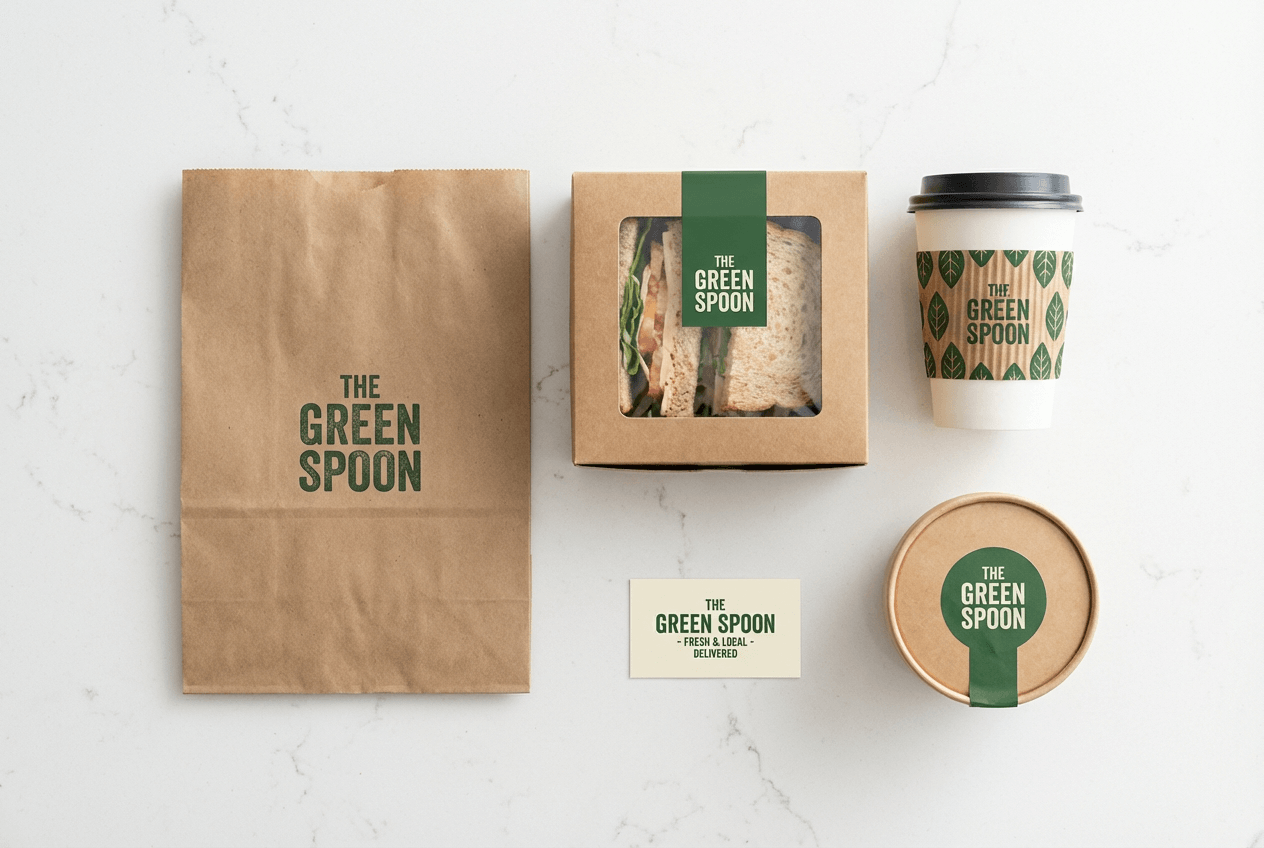
The Printed Ecosystem
Menus deserve special attention. Guests spend under two minutes looking at a menu, so every design choice matters. Organize clear sections, limit main dishes to 8–12 options, place high-profit items in high-visibility zones, and use descriptive, appetite-driven language. Quality paper stock signals professionalism.
Window graphics work 24/7 as silent salespeople. Delivery vehicle wraps generate 30,000 to 70,000 daily impressions with 97% recall. Custom takeout packaging turns every delivery into a mobile ad.
The Architecture of Experience
Fast-casual design has evolved. The best designs “communicate a clear and compelling narrative. Materials, lighting and environmental signage work in harmony to tell a story that feels authentic and immersive”.
Noble Chicken avoided the red and southern influences common among competitors, embracing a rebellious, punk-inspired aesthetic with a mohawked chicken and bright colors. Vicious Biscuit paired an edgy skull-and-crossbones logo (with rolling pins for crossbones) with warm wood and colors pulled directly from their food, red and green from pico, brown biscuits.
The Scalability Question
For multi-location brands, consistency becomes central. Lee’s Famous Recipe Chicken uses the RRR framework: Refresh, Refurbish, Remodel. Critically, the design is a modular “kit-of-parts,” allowing consistency across corporate and franchise locations while accommodating site-specific needs.
Jamba’s “Hello Sunshine” prototype takes a similar approach. The modular design means “you can pull this prototype apart” to suit different location types, from standalone drive-thrus to strip center spaces.
The Bottom Line
A restaurant’s identity touches everything because everything communicates. The logo matters. So does the music. So does the paper the menu is printed on. So does the bag the takeout goes home in.
The brands that succeed treat all these elements as one system. They design with intention, test with real customers, and build for scale without sacrificing soul. The result isn’t just a restaurant. It’s a place that feels like somewhere, not anywhere.
About the Author

Peter Makeshoff
Peter Makeshoff is the founder and main author of Designer Daily.