
A continuously growing collection of graphic design inspiration and resources.
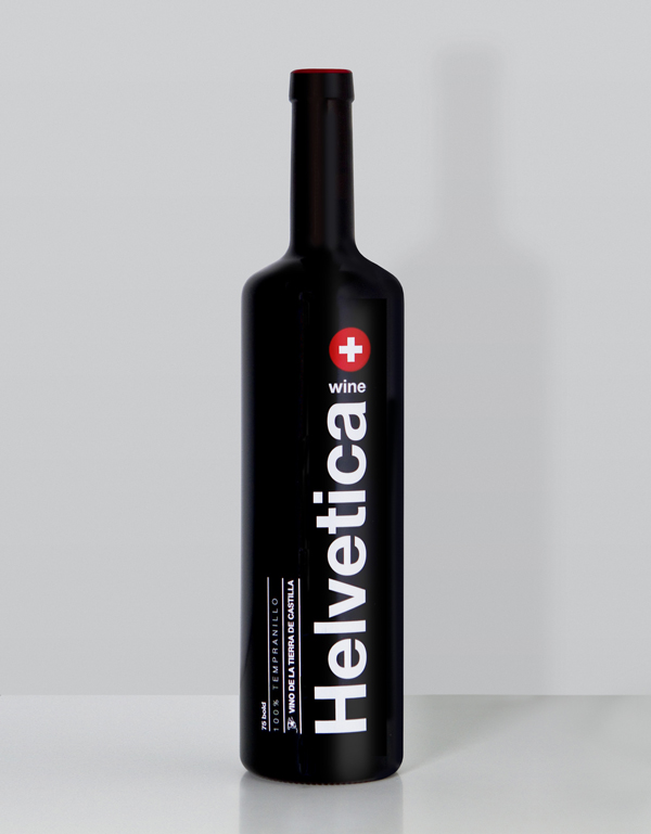
A wine-themed tribute to the most iconic sans-serif font. While this label is quite interesting, I don’t think it works very well as a wine bottle design. At least I wouldn’t buy it in store. It was designed by WildWildWeb and printed as a 1300 serigraphed limited edition.
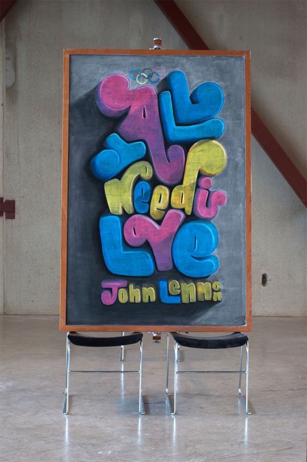
Dangerdust is the alias chosen by two art students that decided to remain anonymous despite creating some amazing chalkboard art. You can discover a new board every week on their Behance page.
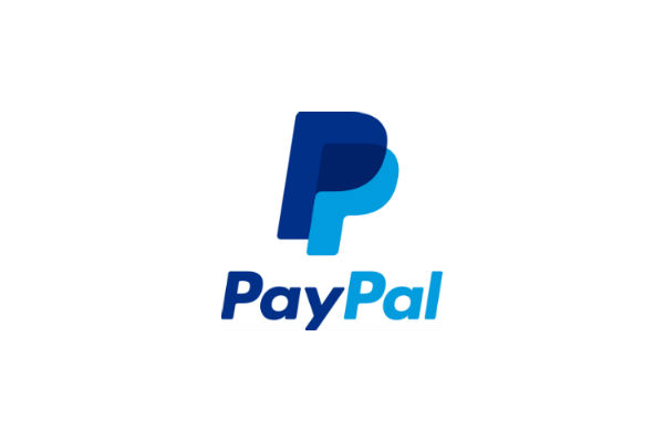
If you connected to your PayPal account recently, you may have noticed that the logo on the top left hand of their interface has changed. The redesign is not a radical one, but the changes are important enough for PayPal to send out press releases about it. Most noticeable, bot capital “P”s have been closed […]
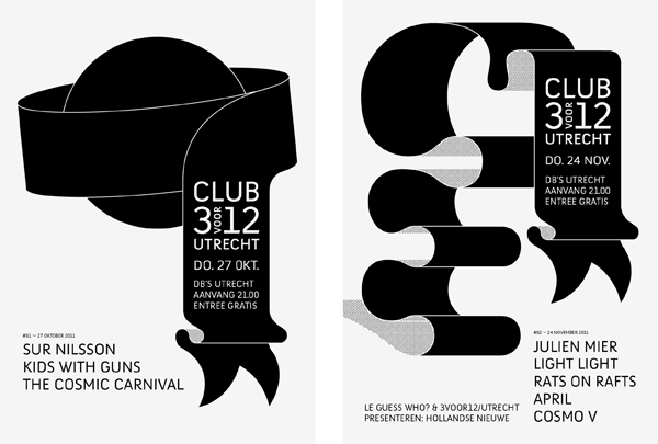
Jasper Jongeling is an independent graphic designer based in Utrecht (the Netherlands). He’s been awarded for his excellency in editorial design.
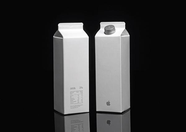
Peddy Mergui is an Israeli artist. She tried to imagine what food packaging could look like if it was done in the style of popular luxury brands. The results are an excellent proof that packaging for food works differently from other types of packaging.

A gorgeous redesign created by Face studio for Folio magazine.
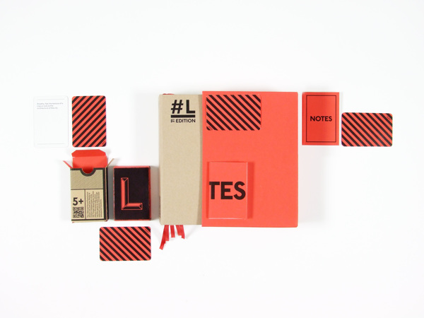
Lucas Machado is a Brasilian graphic designer based in London, UK. His best projects are by far the typographic and editorial design ones.
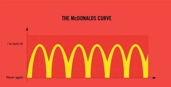
Truth facts are a series of infographies that give you a humorous look at some neglected facts.
Martin Azambuja is a graphic designer from Uruguay who specializes in illustration, identity, packaging design and art direction.
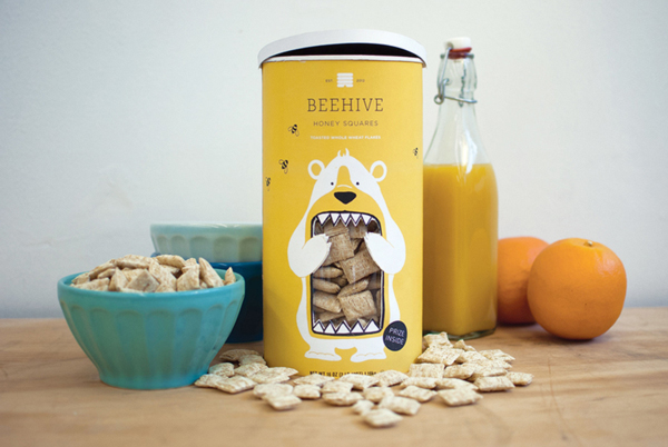
A cute packaging design for Beehive Honey Squares cereal boxes. A great way to stand out from the competition.
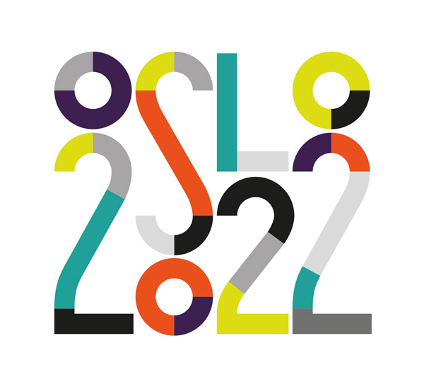
For their bid to host the 2022 Winter Olympics, the city of Oslo asked Snohetta design agency to design their visual identity. The result is a playful and colorful branding that makes a great first impression. Via Dezeen.
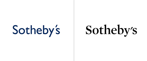
Sotheby’s recently announced a redesign of their logo by Pentagram. As usual, it’s brilliant work by Pentagram, with a choice of font much more suitable for the auction company. This said, I find that the apostrophe in the new logo looks really aweful, wasn’t there a way to make it look nicer? Via Brand New.
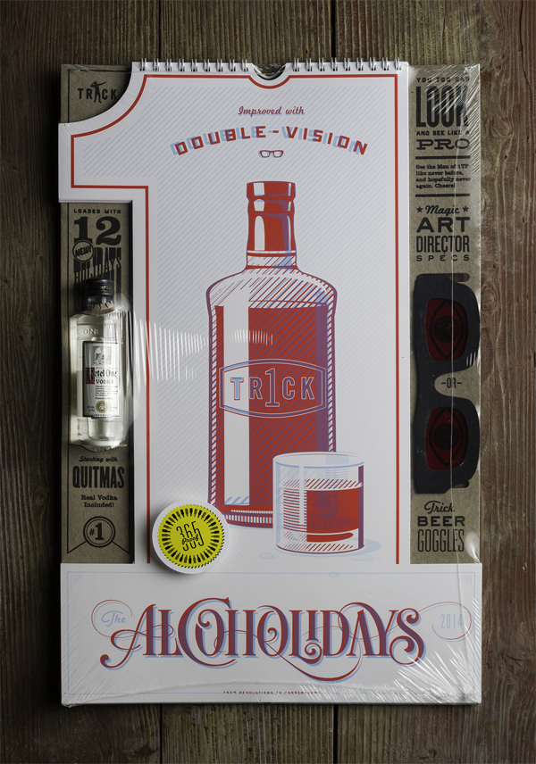
To celebrate their 10 years anniversary, 1 Trick Pony created a limited-edition calendar that gives a glimpse of their drunken nights in 3D.
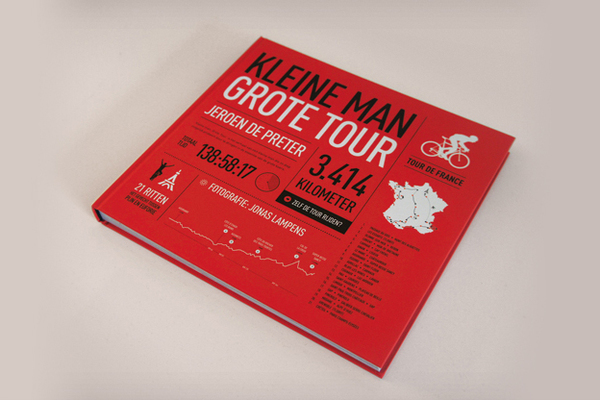
Hootkaai Zeven is a graphic design studio from Belgium that specializes in editorial design, typography and branding. Their work is always creative, using great type and paying a lot of attention to details.
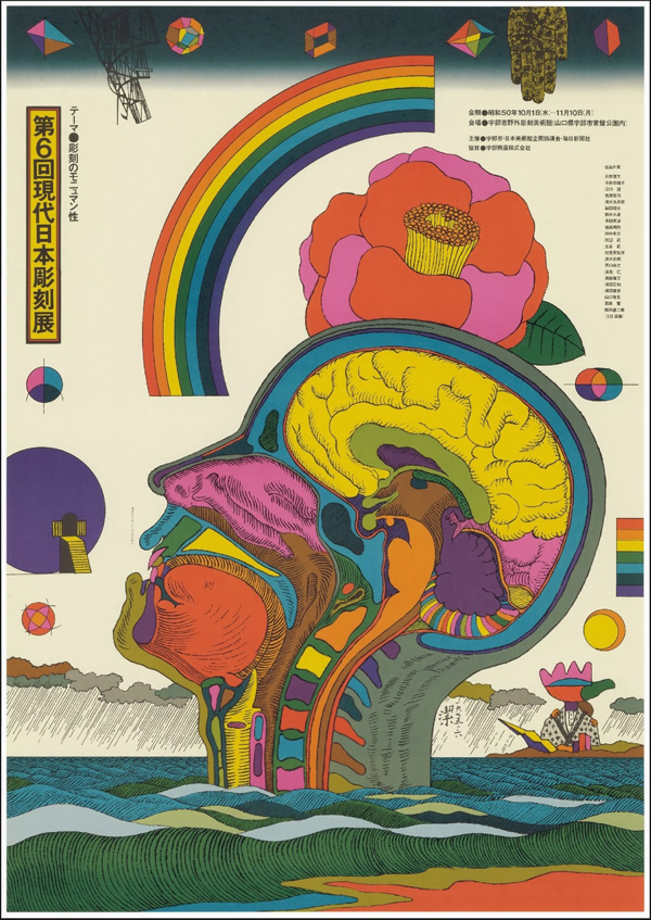
The Art department of the University of Takushoku recently exhibited an overview of some contemporary poster artists of Japan. Many of these posters are really spectacular, and far from the minimalist aesthetics that we are used to in Japanese technology. Via Estampes Japonaises.

