
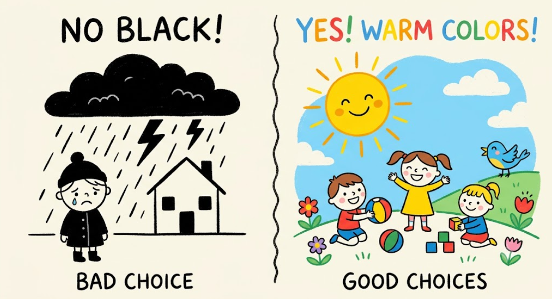
When designing for children’s brands, color is not just an aesthetic choice. It is a communication signal that shapes how both parents and children perceive the brand. One color, in particular, consistently undermines the trust and warmth that children’s products require: black.
Why Black Rejects the Child’s World
Children experience the world through brightness, energy, and play. Their cognitive processing is wired to respond to high-saturation, warm colors like red, yellow, and blue. Black is the opposite of this visual language. It signals power, authority, professionalism, and elegance, but also carries negative associations: depression, coldness, threat, and mourning. For a children’s brand, these associations are toxic.
Research has directly linked black to decreased sales in children’s product categories. A marketing analysis of e-commerce logos found that using black in online children’s goods stores leads to “a significant decrease in site conversion”. Parents and children do not process black as playful or inviting. They process it as heavy, serious, and unapproachable. The color that works for luxury fashion fails for children’s products.
What Parents Are Looking For
Parents are not just buying a product. They are buying safety, warmth, and trust. Children’s brands that succeed use bright, warm colors that communicate joy and security. Yellow signals optimism and happiness. Orange conveys warmth and positivity. Pink and soft purple are associated with children and women, increasing sales.
Black signals none of these things. It creates a visual barrier between the child and the brand. A brand that appears serious, dark, or cold will not connect with children, and parents will not trust it with their child’s well-being.
The Brand That Learned the Hard Way
In 2024, the children’s shoe brand Ginoble learned this lesson through a different kind of color failure. The company labeled a yellow shoe “Servant Yellow” due to a translation error from the Pantone color “Minion Yellow.” A consumer complained that the name was inappropriate for a children’s product, and the company quickly removed the shoe and issued an apology.
The fallout was swift. The brand’s reputation was damaged, and the product was pulled from shelves. While this was a naming error rather than a color choice, it illustrates a fundamental truth: children’s brands operate under heightened scrutiny. Any association that could be perceived as negative, whether through color or through the associations that color carries, is a risk.
Colors That Work Better
The safest choice for a children’s brand is not a single color. It is a palette of bright, warm, saturated colors that signal joy and safety. A study of children’s clothing brands found that reddish-to-yellowish hues were most commonly used. Brands projecting a “cute” and “gorgeous” image used a greater array of colors, while those projecting a “luxurious” image used less saturated colors. For mass-market appeal, saturated warmth wins over muted sophistication.
Black is not the only color to avoid. Gray is also classified as undesirable for children’s products, and purple can carry associations of luxury that do not align with a children’s brand. The color palette for a children’s brand should reflect the energy of childhood, not the formality of adulthood.
The Bottom Line
Black is not a safe choice for a children’s brand. It signals the wrong emotions, repels parents, and fails to connect with children. The brands that succeed are those that embrace warmth, brightness, and playfulness. They do not use black as a primary color. They do not use it as an accent. They do not use it at all.
If you are designing a children’s brand, choose yellow. Choose orange. Choose pink. Choose blue. Do not choose black. The color you avoid is as important as the color you choose.
About the Author

Peter Makeshoff
Peter Makeshoff is the founder and main author of Designer Daily.