In a fast-paced world, brands can’t stay static and live with the same identity as their products evolve quickly. This is especially true for cutting-edge technology brands such as Amazfit, who need to be constantly at their best in a hyper-competitive environment. They have recently tackled the challenge of re-thinking their brand brilliantly.
About Amazfit
Amazfit is a brand of smart wearables, with products ranging from smartwatches to fitness gear. Mixing fashion design and innovative technology, they allow for their devices to become integral parts of their customers’ personal style. They’ve become the perfect companion for anyone wanting to live a healthy lifestyle, so their brand needed to reflect this more thoroughly.
The Re-design process
Achieving such a re-branding for a global brand like Amazfit is a task that shouldn’t be taken lightly, as it has implications that can strongly impact the whole business.
For that reason, Amazfit chose to work with a proven design studio, LANDOR, with whom they tightly collaborated on the re-design. LANDOR goes by a philosophy known as “The Agility Paradox”, which states that, in a technological world, any industry can be disrupted from anywhere at any time, forcing brands to be perpetually evolving.
In fact, Amazfit has changed a lot from its beginnings, so the brand had to reflect that and its adaptability. The re-brand had to start with an in-depth analytical process before arriving at the new brand strategy. Together with the branding studio, they went through comprehensive consumer research, market observation, and internal audits, leading to Amazfit’s NEW brand vision to free more people to live their passions and express their active spirit.

The new branding
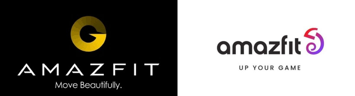
The new symbol for the logo design is a stylish and colorful chameleon that perfectly embodies the values of the brand: adaptably, playfulness, and an inclusive, colorful world. It was largely influenced by the consumer feedbacks, who pointed out the importance of reflecting their active lifestyle.
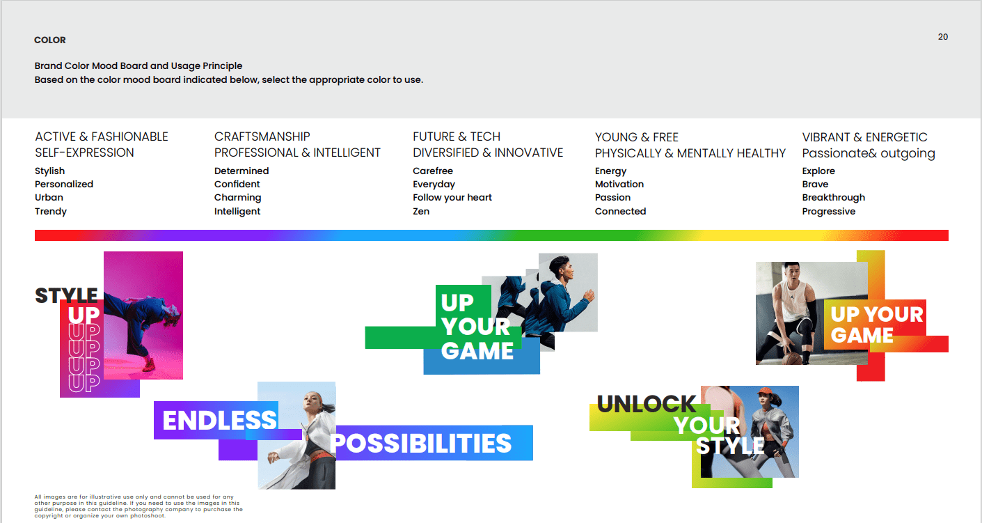
The logo looks like a chameleon. The reason is Amazfit’s constantly changing universe as a brand and product line. The chameleon obviously has changing colors, fitting into its environment. The based color line was picked as such:
- Violet – Active & Fashionable
- Blue – Craftsmanship, Professional & intelligent
- Green – Future & Tech, diversified & innovative
- Yellow – young & free, physically & mentally healthy
- Orange – vibrant & energetic, passionate & outgoing
About the Author

Peter Makeshoff
Peter Makeshoff is the founder and main author of Designer Daily.