As designers, we often operate on intuition. We “feel” when a layout is right or when a button is in the wrong place. But what if that intuition could be backed by a century-old psychology that explains exactly how our brains make sense of visual information?
Enter the Gestalt Principles.
Born from German psychology in the 1920s, Gestalt (meaning “unified whole”) theory is built on the idea that our brains are hardwired to see structure, patterns, and relationships by default. Instead of perceiving a collection of disconnected elements, we group them into a coherent whole.
For UI/UX designers, these principles are not just academic trivia; they are the bedrock of creating intuitive, user-friendly, and effective designs. Let’s break down the key Gestalt principles with real-world examples from the interfaces you use every day.
1. Proximity: Elements that are close together are perceived as related.
The Gist: Our brains group objects that are near each other, separating them from those that are farther apart. This is one of the most powerful tools for creating structure and organization without adding visual clutter.
UI/UX in Practice:
Think of any form you’ve ever filled out online. How do you know which label corresponds to which input field?

- Bad Example: Labels are equidistant from multiple input fields, causing confusion.
- Good Example: The label “First Name” is placed in close proximity to its text box, and there is clear, generous space between that group and the “Last Name” group. This visual grouping happens instantly, without the need for lines or boxes.
Takeaway: Use white space strategically to imply relationships. Group related interface elements (like a label and its input, or an icon and its text) by placing them close together.
2. Similarity: Elements that share similar attributes are perceived as related.
The Gist: Objects that look alike—whether through color, shape, size, or orientation—are perceived as part of the same group or as having the same function.
UI/UX in Practice:
Navigation menus are the classic example. But let’s look at a product listing.
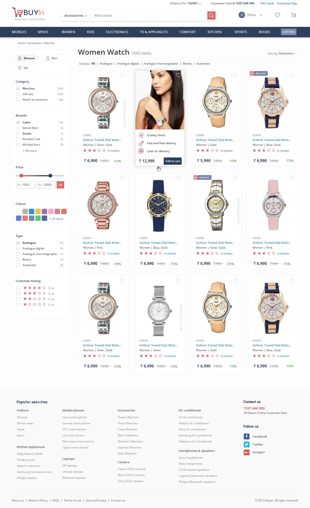
Each product card has the same structure: image, title, price, and a button. Because they share the same visual attributes (same size, same font treatments, same button style), we instantly understand that they are the same type of object. Furthermore, if one “Add to Cart” button were a different color, we would perceive it as different—perhaps it’s out of stock, or already in the cart.
Takeaway: Establish consistent styles for similar elements (like all primary buttons) to create a predictable and scannable interface. Conversely, make different elements (like a “Delete” action) look distinctly different.
3. Closure: Our brains fill in the gaps to see a complete object.
The Gist: When presented with a complex arrangement of elements, we tend to look for a single, recognizable pattern. We will mentally “close” gaps to perceive a complete shape.
UI/UX in Practice:
Logo design famously uses this principle (see the WWF panda or the NBC peacock). In UI, it’s often used in loading animations and icon design.
The IBM logo is made of disconnected blue stripes, but we effortlessly read the letters “IBM.” In a UI, a loading spinner might be a circle with gaps, but our brain perceives a single, rotating shape. This allows designers to create recognizable forms with minimal elements, reducing cognitive load.
Takeaway: You don’t have to show every detail. Use suggestive shapes and negative space to create elegant, simple icons and graphics that the user’s mind will complete.
4. Common Region: Elements within a bounded area are perceived as a group.
The Gist: This is proximity’s powerful cousin. By placing elements inside a clearly defined boundary—like a box, a background color, or a subtle shadow—you create a strong perceived group.
UI/UX in Practice:
Look at any modern web app’s card-based layout.
On a dashboard, a “Statistics” card might contain a title, a chart, and a data point. Even if these elements are spaced out, the shared background and subtle border firmly group them together, separating them from the “Recent Activity” card right next to it. This is why cards are so effective for organizing diverse pieces of information on a single screen.
Takeaway: When proximity alone isn’t enough to create a strong group, use a common background, border, or shadow to define a “container” for related content.
5. Figure/Ground: We instinctively separate elements into foreground (the figure) and background (the ground).
The Gist: This is the basis for how we perceive depth and focus. The “figure” is the focal element, and the “ground” is the backdrop. A clear distinction is crucial for readability and hierarchy.
UI/UX in Practice:
Modal windows and pop-ups are the most direct application.
When a modal appears, the rest of the interface is often darkened or blurred. This immediately pushes the background content into the “ground,” making the modal the clear “figure” that demands the user’s attention. Without this effect, the modal would feel less distinct and more difficult to parse.
Takeaway: Use contrast, color, and blur to create a clear hierarchy between interactive elements (figures) and their context (ground). This is essential for overlays, modals, and navigation menus.
6. Focal Point (Prägnanz): The mind will interpret ambiguous images in the simplest way possible.
The Gist: Also known as the “law of simplicity,” this overarching principle states that we naturally order our experience in a manner that is regular, orderly, and simple. Every stimulus is perceived in its most simple form.
UI/UX in Practice:
A cluttered, confusing user interface violates this principle. A clean, well-organized one embraces it.
Consider the Google homepage. What do you see? A logo, a search bar, and two buttons. It’s the simplest possible interpretation of a search engine. There is no ambiguity. Your brain doesn’t have to work to figure out what to do. A competing, cluttered portal page with countless links and modules is complex and ambiguous, forcing the user to parse and simplify it themselves.
Takeaway: Reduce complexity. Strive for clarity and simplicity above all else. The easiest design for the brain to process is the one it will prefer.
Design with the Brain in Mind
The Gestalt Principles aren’t a set of rigid rules to be followed blindly. They are a framework for understanding the unconscious processes of visual perception. By designing with these principles in mind, you work with the user’s brain, not against it.
You create interfaces that feel intuitive because they are built on the very psychology that defines intuition itself. So the next time you’re refining a layout, ask yourself: How is my design using proximity, similarity, and closure to tell a clear, simple story? The answer will lead you to better design.
About the Author

Peter Makeshoff
Peter Makeshoff is the founder and main author of Designer Daily.