![]()
At Cincinnati Ballet, a change of leadership was what triggered a redesign of the institution’s logo. The rebranding was much needed, as the Ballet had serious visual inconsistencies.
LPK Design was commissionned to do the design work, opting for a logo mark that mixes a classic Didone typeface with calligraphic work, thus creating a sense of movement that’s very welcome for a Ballet. For those interested in knowing more about this project, you can read a full case study about it on Amy Jacobus’ website.
![]()
Above: the old logo and incoherences in branding for the Ballet and collateral activites.
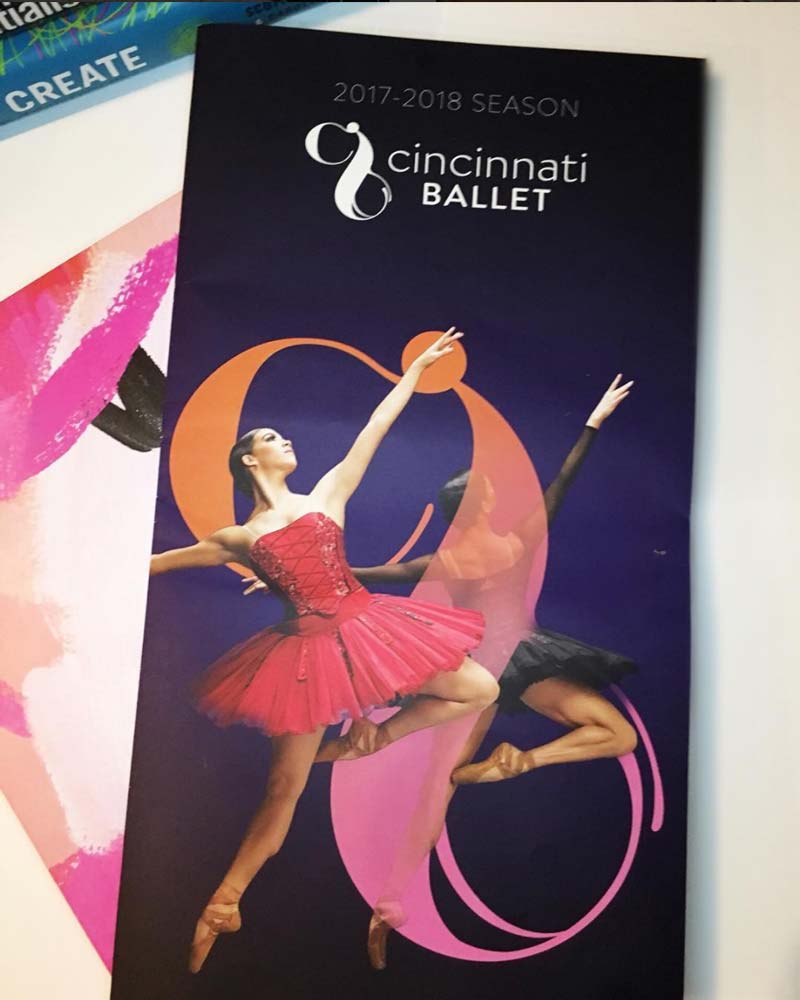
Above: preview of the logo in action.
![]()
Above: Positive and negative previews of the new logo.
About the Author

Peter Makeshoff
Peter Makeshoff is the founder and main author of Designer Daily.