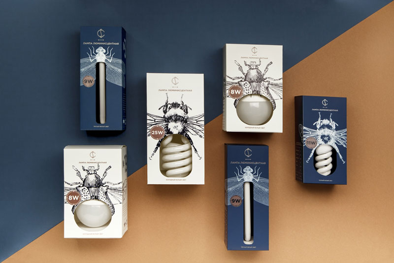
To create this lovely branding for CS Electric, Belarus-based graphic designer Angelina Pischikova worked with illustrator Anna Orlovskaya. They took their inspiration from old physics books and their very detailed illustrations to build a new kind of electric insects. The result is both poetic and efficient, with a clear, minimalist use of white space and type.

Refinery 43 is one of these super reliable design studios. They are not superstars, but you can count on them to always produce top notch design work. Located in Newburyport, Massachusetts, they work as a small team to do big things. But just see for yourself.
When you come from Europe, the tipping culture is a somewhat surprising part of American culture. Tipping culture means that waiters are not getting paid well if the restaurant has little business. When business goes well, waiters are getting a share of the revenue that is not really fair for chefs, dishwashers, and all other […]
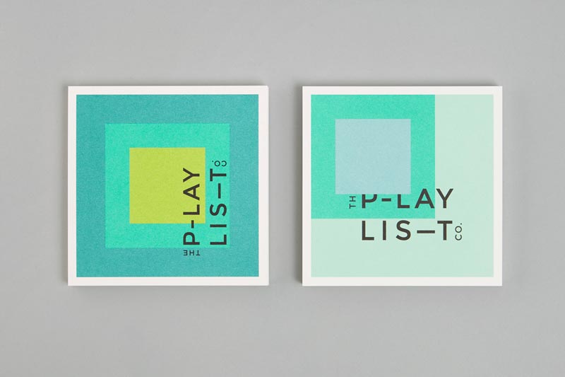
Toronto based graphic design agency Blok created a pretty cool geometric branding for The Playlist. While grid-based, this identity is just as playful as you would expect it. The designers had fun moving the colors around to create layouts that match the music business consultants’ activity.
On Designer Daily, we’ve often discussed the importance of white space, here is some practical inspiration in logo design. Knoll A subtle logo that looks like a gift, designed by NB branding & communication. Ryan Biggs associates A clever way to combine the company name’s initial letters. Design by id29. Yoga Australia Nice way to […]
The Tokyo 2020 Olympics logo is a disaster. It’s not a matter of design, the official logo doesn’t look too bad. The problem comes from all the controversy that came with the creation of the logo. The first logo proposal was abandonned because of plagiarism accusations, so there is a lot of bad PR around the branding […]
