Fonts selection and resources for type designers.

I just watched the Fontplore demo and I have to admit that it is quite spectacular, but will it be really useful to anyone or is it just another big ass table? Anyway I’d love to put my hands on one of those to play with it for a while, or even to acquire one […]
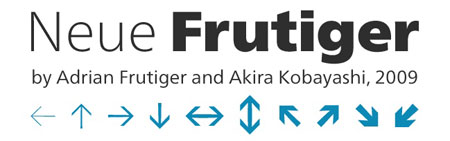
Linotype has a great discount on Neue Frutiger value packs for the launch of this great new font. This kind of high-quality fonts is quite expensive for freelancers or design students, so I assume that this is a great opportunity to buy it on Linotype’s site. What got better in Neue Frutiger? Improving an amazing […]
Last time I wrote about free fonts, people complained arguing that free fonts can’t be used in professional designs, partly because of the lack of font variations. In this post, I’ve been looking for quality fonts that have more than one weight and found quite a few. Of course, these fonts don’t compare with Helvetica […]
EDIT: Please note that some of these fonts are for personal use only, make sure you always check the license before using the font. Even though you’ll have to pay for the best fonts, like Helvetica or Univers, the web is full of quality fonts that are perfectly suitable for professional design work and business […]
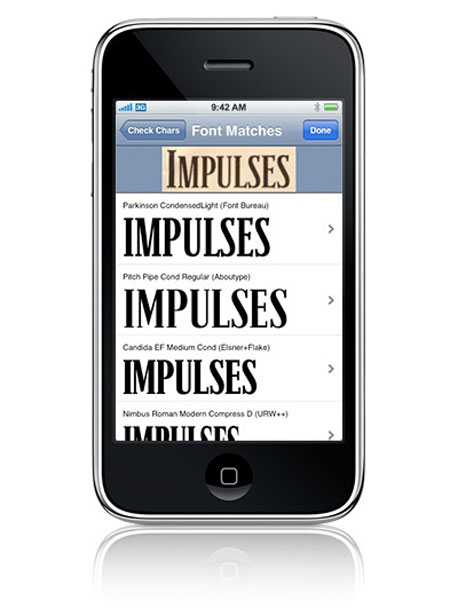
Those of you who already are users of the popular “What the Font?” online service and happy owners of an iPhone will be happy to hear that the service has its own iPhone app now. After installing it, you just need to take a picture of the font you want to identify, crop it, specify […]
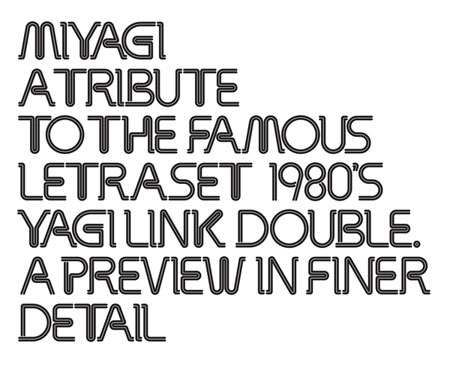
Miyagi is a redesign of “Yagi Link Double”, a letraset font. It’s a creative and beautiful work by designer Alex Haigh. I thought that Designer Daily’s readers would be interested in an interview with him. Don’t forget to visit the online foundry he’s launching: Hypefortype. There will probably be more great fonts coming from there, […]
You can probably spot a type specimen when you see one. They started as no more than a way for printers to demonstrate to their buyers how a certain typeface would look at various sizes on the paper. With a type specimen, a type’s characters could appear on paper, bad kerning could be spotted, and […]
![16 Type Foundries You’ve Probably Never Heard Before And 1 Font From Their Libraries [Updated With Specimens]](https://www.designer-daily.com/wp-content/uploads/2008/11/joshua-darden-freight.jpg)
In my last two post, I tried identifying alternatives to well known serif and sans typefaces. I barely scratched the surface, so I thought I’d provide a list of more independent, less known type foundries I like—ones I haven’t included in the past—along with a review of one notable font on her production table. One […]
![Alternatives To Your Favorite Sans Serif Typefaces [Updated With Specimens]](https://www.designer-daily.com/wp-content/uploads/2008/10/gotham-hoefler-frere-jones-300x200.gif)
Gotham Ah, Gotham, the vernacular, everyman sans serif. It’s likely to be the Helvetica of 2007–08, or better yet, “The New Helvetica.” It’s forms are sturdy, and its character distinct (and I daresay “American,” much like how Gill Sans is “English” or a Fraktur is “German.”) These alternatives, though, are available when you want something […]
![Alternatives To Your Favorite Serif Typefaces [Updated With Specimens]](https://www.designer-daily.com/wp-content/uploads/2008/10/adobe-jenson.png)
Hello, my name is Bram, a brand strategist, hacker and typophile. I’ll be guest blogging for Designer Daily during Mirko’s vacation week. Consider this fact: today, we have more typefaces than ever designed, yet most designers chose to stick with their Helveticas, Gills and Caslons. This isn’t bad, per se; after all, going with the […]
After my graphic design school I quickly started to gain interest in webdesign, I also quickly started to get frustrated by the limitations of web typography. The first thing I did was head to flash to be able to use any font I wanted, until I did understand why it wasn’t a good idea to […]
Some typographic experiments by Tobias Battenberg, the latest being about Akzidenz Grotesk and really cool. Via Type for you.
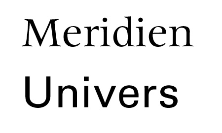
The Meridien and Univers typefaces have at least two things in common: they are made by the same person and are both meant to be friendly to any language. Adrian Frutiger worked on the Meridien after noticing the problems he had for multi-languages book designs. Every language had its own specificities and tricks, for example […]
