Logo designers at their best, some great inspiration for all graphic designers.
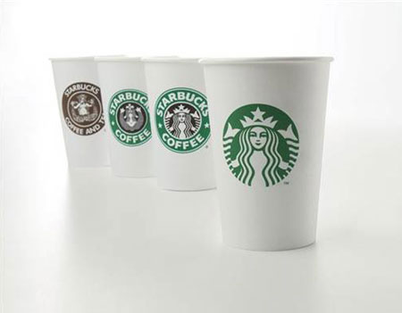
The popular (and overrated, if you ask me) coffee chain got a good logo redesign. The name is removed as well as the black color, a more simple and refreshing logo. Via redesign related.
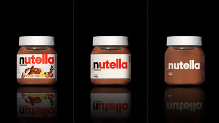
An interesting project by Antrepo studio. They took some popular brands’ packaging and made it evolve into minimalist packages. It works very well for many, at least on the designer’s point of view. Via Fubiz
Logoblog has a roundup of noticeable logo redesigns of 2010. It’s a pretty good list, but I cannot understand how the iTunes icon redesign can be considered as a good redesign.
Form is a british design studio, they produce great branding and editorial design.
In South Africa, the state-owned telecom company introduced the branding of their new mobile service: 8.ta. They started a big pre-launched campaign to introduce the correct prunonciation of the brand. For this pre-launch, McCann Erickson created a set of billboards, print advertisements and commercials. Formally, I liked the logo and ads a lot, but I […]
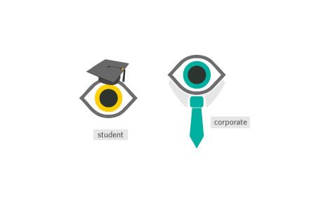
Giving a visual identity to faceless companies takes time and effort. To inspire you I have gathered a serie of wonderfully executed corporate identities. 1. Perch By Rubber Design & Co 2. Ceidiog By NotJones 3. Eskimo fashion store By Synergie 4. Julian Restaurant By Nathaniel Cooper 5. Shatterbox By Paperwhite studio 6. Claridge By […]
Lots of great identity work and magazine layouts in this Vienna based design company’s portolio.
Due to their particular role in society, museums pay a lot of attention to every aspects of their visual identity; they hire famous architects to design their buildings and invest on coherent visual identity. This selection gives you an overview of museum logos. 1. Tate Modern The famous art museum has an unconventional logo, Logo […]