Logo designers at their best, some great inspiration for all graphic designers.
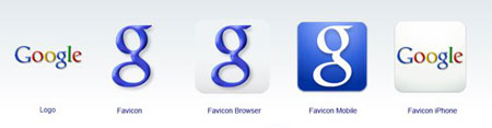
When you are a large multinational company like Google, the slightest changes in your identity will quickly be noticed. A few week ago, the big capital “G” that was used as a favicon on every google site turned into an ugly lower-case “g”. That tiny event gave birth to tons of reactions on blogs or […]
Now this is what I call a bad visual identity. First, I don’t even understand why a visual identity would be needed for the UE’s presidency. If they want to have a coherent design, shouldn’t they just have a strong identity that is customizable according to whichever is presiding the UE? Well, let’s assume for […]

In this hilarious video, Georges Carlin takes on guys with names like Todd or Taylor. Even though it wasn’t his purpose, he points out the fact that branding does start at birth, and that unfortunatly you won’t be able to have control over your name. I think that it’s the same for business. We all […]

When I first saw the above piece of furniture by Takeshi Miyakawa, my first thoughts were: wow, what a brilliant design! Then I did some more practical thinking and realized that it wouldn’t fit in most standard appartments, as well as I wouldn’t know what to put in it. A question that I never could […]
Creative review has a good post about the new branding of Swisscom, the main telecom company in Switzerland. I really don’t what to think about this logo, it quite smooth but too complicated. The typography is nice but feels a bit odd. I really have mixed feeling on this new logo, maybe it’s because I […]
Nice to watch: the evolution of tech companies’ logos. If only Canon (sorry, Kwanon) could have kept its first logo. Interesting to learn where some names come from.
2007 is over, time to take a look at the logo design trends throughout that year. Logo Lounge has an interesting review of different styles of logos that stood out in 2007.
Discover the work of Chris Haycock, visual director at Uber.
Extraverage, the above average portfolio of Karoly Kiralyfalvi. Via DesignFreak.
Going from a traditional logo to a modern one is not easy, from my point of view the Darien Library did that successfully.
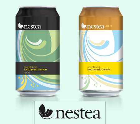
The above logos and cans are a good example of how good the work of “Letters & Numbers” can be.
“Make my logo bigger”, every designer has probably heard this sentence a thousand times. Now there is a new (fake) product that will finally satisfy your clients, check it out on this hilarious ad. Via FreelanceSwitch.
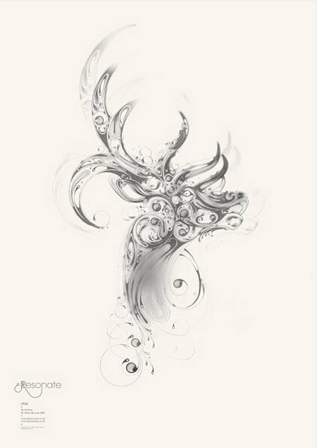
Si Scott is a great UK designer, discover more about him and his work on his website, this post or this interview. Via Monoscope via Type for you.
