
A website’s content and layout can make or break its appeal.
Adobe found that 38% of people will lose interest in a website if they don’t like how it looks. And another 39% of people will give up on a website if it loads too slowly.
However, web design is more than just making a website look good.
It’s also about creating a positive user experience (UX) that encourages visitors to stay on your site, explore your content, and take action.
In this article, we’ll share some web design best practices and key elements to help you design a professional and user-friendly website.
Why Web Design Is Important and How to Find the Right Designer?
Web design is important because it affects how your business is perceived by your target customers.
According to a study by Stanford University, 75% of users judge a website’s credibility based on its design. Another study by Google found that users form an impression of a website in 50 milliseconds.
That means you have less than a second to capture their attention and convince them to stay on your site.
Therefore, web design is not something you can afford to ignore or neglect. It can make or break your online success.
Also, web design isn’t something everyone can do. You need experts with the skills, knowledge, and experience to create effective designs from scratch.
There are many expert web designers worldwide, no matter where you live. Search on Google “web design + your location” and find many qualified designers in your area.
For example, if you live in Melbourne and looking for a web designer to design your page, search by “web design Melbourne”.
5 Key Elements for a Professional and User-Friendly Website
Here are some of the best practices and key elements that you need to keep in mind while designing your website:
1. Define Your Goal and Audience
Your website design should reflect your goal and audience. Think about what you want your website to do and who you want to reach. What do they want, like, and struggle with?
Having a clear goal and audience will help you create a website that is relevant, valuable, and engaging website for your visitors.
Ask your existing customers about their experience with your brand, their feedback on your website, and their suggestions for improvement.
Explore how your rivals present themselves online and on social platforms. Learn from how they showcase their brand and what content style gets more engagement.
It will help you choose the right design elements that suit your brand personality and message, such as colors, fonts, images, and layouts.
2. Use a Simple and Intuitive Navigation
Your website users should find their way around your website and access the information they need as fast as possible. It’ll reduce your bounce rate and increase your conversion rate.
Some tips for creating easy navigation are:
- Use descriptive labels that clearly indicate what each page or section is about
- Use a consistent layout and style for your navigation across all pages
- Use breadcrumbs or indicators to show users where they are on your website
- Use drop-down menus or submenus to organize your content into categories or subcategories
- Use a search bar or filter options to help users find specific information quickly
- Use clear and prominent call-to-action buttons or links to guide users to the next step
Don’t understand what we’re talking about? Take a look at Amazon’s website. It has simple and intuitive navigation that allows users to browse through millions of products easily.
3. Use Responsive Design
It is a web design technique allowing your website to adapt to various screen sizes and multiple devices. It should look equally good on your mobile, tablet, and pc.
It is essential for creating a user-friendly website because it improves your accessibility, usability, and performance. It also helps you reach more potential customers who use mobile devices to access the internet.
According to Statista, mobile devices accounted for 58.33% of global web traffic in 2023. And it’s been consistently over 50% since 2017.
That means more than half of your visitors will likely use mobile devices to access your website. So, if it’s not responsive, you might lose them to your competitors with responsive websites.
Some tips for creating a responsive website are:
- Use flexible grids and layouts that adjust to different screen widths
- Use relative units, such as percentages, ems, or rems, instead of absolute units, such as pixels, for font sizes, margins, and paddings
- Use images and videos that are optimized for different resolutions and bandwidths
4. Use Visual Hierarchy and White Space
Visual hierarchy is the way of organizing and displaying design elements to show their significance and connection.
It helps users scan and comprehend your website content easily and quickly.
White space refers to the blank areas that separate design elements, such as text, images, buttons, and icons.
It helps create contrast, balance, and harmony in your web design. It also helps reduce clutter, improve readability, and highlight important elements.
Here are some tips to improve these elements:
- Use size, color, contrast, alignment, proximity, and repetition to create a visual hierarchy
- Use headings, subheadings, bullet points, lists, and quotes to break up your text into manageable chunks
- Use images, icons, graphs, charts, and tables to illustrate your points and data
- Use white space to create breathing room for your design elements and guide users’ eyes to the focal points
- Use white space to make a clear distinction between different sections or pages of your website
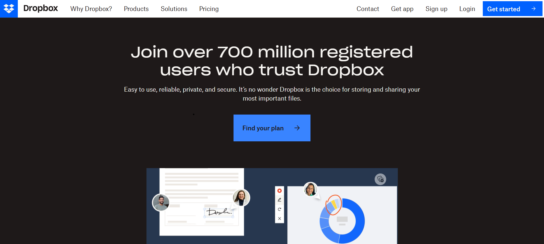
Dropbox’s homepage design is an excellent example of visual hierarchy.
The main heading, “Join over 700 million registered users who trust Dropbox” is the first thing you notice on the page. It is large and prominent, and it communicates its value proposition clearly.
Below it, the “Find your plan” CTA invites you to take action. You can either click this CTA or explore the menu items above for more options.
5. Use Consistent Branding and Style
Branding is the art of crafting a unique and memorable image and voice for your business or organization. It involves aspects such as your name, logo, slogan, color scheme, typography, voice, tone, and message.
Style is the way you express your branding through your web design. It involves aspects such as your layout, graphics, images, icons, fonts, colors, animations, transitions, and effects.
Using consistent branding and style across all analog and digital channels can help you create a professional and user-friendly website because it can:
- Establish your credibility and authority in your industry or niche
- Increase your recognition and recall among your target audience
- Communicate your value proposition and differentiation from your competitors
- Create an emotional connection with your visitors
Some tips for using consistent branding and style are:
- Use a logo that represents your brand identity and values
- Use a color scheme that matches your brand personality and message
- Use typography that is legible, readable, and suitable for your brand voice and tone
- Use graphics, images, and icons that are relevant to your brand theme and content
- Use animations, transitions, and effects that are appropriate for your brand’s mood and purpose
Find Your Inspiration
All these said, web design is a largely subjective matter. It doesn’t matter how well you revamp your web design; not all people aren’t going to like it in the same way.
Just stick to these tried-and-true web design principles to make it appeal to the masses. And for inspiration, visit Behance and Dribble.
We hope this article has given you some useful tips and insights on designing a website that users love. If you have any questions or feedback, feel free to leave a comment below.
Happy designing!
About the Author

Peter Makeshoff
Peter Makeshoff is the founder and main author of Designer Daily.