Typographic inspiration, tools and resources. Find even more on our typography blog.

I am glad to announce the first group writing project on Designer Daily. This will hopefuly end up with a variety of great design articles as well as give you an opportunity to connect with other designers and bloggers. There is also plenty of prizes out there, so don’t miss the chance. Please read the […]
The web is full of resources, but they’re often hard to reach. This is the reason why I think it’s important to organize them with a coherent structure and share it with you. So just bookmark this page for whenever you’ll need it, it’ll be useful. Please also mention if I missed anything. Organizing Sample […]
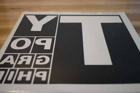
Typographie: A Manual of Design is a must-have book for every graphic designer. The author, Emil Ruder, is a Swiss typographer who thaught in that field for over twenty-five years and also became famous for his own design work. As you can guess from the title of the book, this manual will teach you a […]
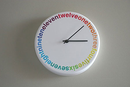
Clock by Richard Shed on FFFFOUND! History of graphic design Do Not Disturb Hotel Door Hangers 54 Creative Logos Hand-picked From Logopond Clever Bradesco Olympics Ads A Forced Marriage of Award-winning Artists Noma Bar illustration The geekiest window ever I met the Walrus 30 inspiring Flickr groups on typography Type projects by Fanette Mellier A […]
I only came across the TypeCulture website today, it’s a real shame I didn’t get to discover it earlier. This site is pretty much the best one I’ve seen on the topic of typography (apart from I Love Typography of course). You’ll find in-depth articles there, as well as loads of typography resources or great […]
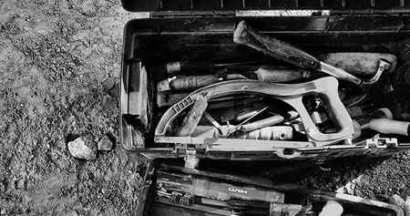
When talking about street typography, people will immediatly think of graffiti. This is of course part of the typographic elements you’ll see in the streets, but it’s far from being all of it. Street typography consists of every typographic element that you can possibly find in cities outdoors, such as billboards, graffitis, road signs, shop […]

There isn’t many blogs solely dedicated to typography, but many blogging graphic designers out there love typography and they usually tend to be either grid maniacs or letterpress lovers, or even both in many cases. The video above isn’t about one of these two topics, but it’s still very interesting because it is very down […]
I’ve been having a lot of fun this morning with the Type is Art website. This experiment let’s you appreciate the beauty of type by focusing on parts of a character. It is also a good way for beginners to learn important typography terms, since the site explains them in a very simple way. I […]
Logo lovers will be glad to discover David Airey’s new site: iconic logo designers. The popular logo designer introduces there some of the world’s most iconic logo designers. Many of my favourite designers are represented there, such as Otl Aicher, Armin Hofman, Saul Bass or Alan Fletcher. I also got to discover some designers I […]
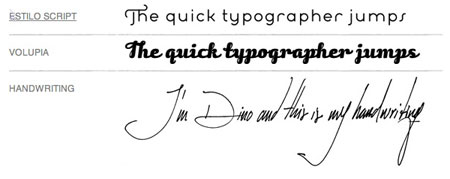
Ever wondered if famous typographers have a good handwriting? I did, probably because I have a shitty handwriting myself and hope that I’ll be able to create a good font someday (working on it). The Man in Blue did more than just wondering about that, he actually asked some prominent typographers to send him a […]
Craig Ward couldn’t chose a better name for his website. Turning words into pictures is just what he does the best. His editorial work takes typography to the next level in both personal and professional work. Visit his website to check out more.
After my graphic design school I quickly started to gain interest in webdesign, I also quickly started to get frustrated by the limitations of web typography. The first thing I did was head to flash to be able to use any font I wanted, until I did understand why it wasn’t a good idea to […]
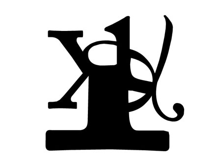
Discover the alphabet letter by letter with this amazing typography pop-up book. With a very creative use of forms and space, it shows the correlation between some letters with some cool transitions. I love the part with C turning into a D or the O – P going Q – R. Impressive work.
Plumbing art Hairstyles your mother wouldn’t approve History moments in Lego Speakers designed the way they should be Whiskas origami advertisement Helvetica Poster Beginner jQuery tutorials Help yourself Helvetica calendar 2008 Video games ruined my life Giant letters furniture Typographic packaging The anatomy of a gummy bear If you don’t want to miss any of […]
Specialized in editorial design, so+ba gives books and magazines fresh and creative looks.

