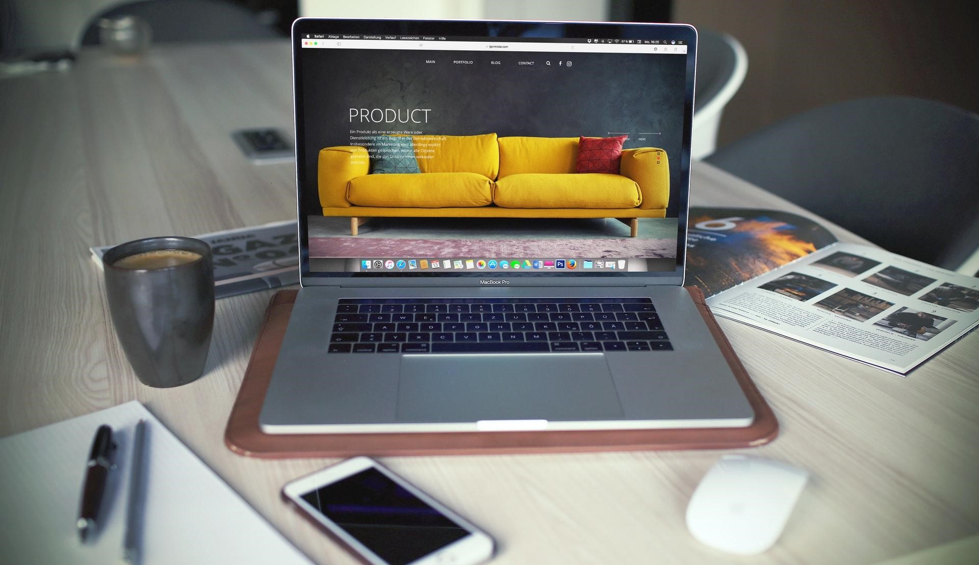
Launching your start-up is a cause for celebration, but your branding doesn’t start and end with the company’s domain and slogan. There’s still a lot of work to do! Now, it’s time to focus on gaining traction with your audience to create a stunning online presence. This requires a web designer to create mockups for […]
There are many factors that are involved in creating a successful brand and business that customers will want to interact with. While your mission, values, and purpose are just a few factors in the ten pillars of successful branding, your brand identity system is also important too. Some features that are involved in creating a […]

Branding is a crucial element for every company’s future. By definition, it can be explained as a marketing tool (symbol, name or design) that can be used for recognition of one’s company. But in reality, it’s more than that. If a company isn’t attractive just by browsing it on the internet, you’re doing it wrong […]

When it comes to building a career, you would always want to opt for the best option that is available to you. Now, if you are a software designer or engineer, you would not settle for anything meager. Given how technology has found a way to employ itself, win, and run almost every industry and […]
A good brand equals great business. Businesses that present a brand consistently across their business can increase their revenue by up to 23 percent, according to statistics cited by Forbes. With nearly every business expert continually driving home the importance of branding for business success, it’s no surprise that companies are now plugging millions into building a […]
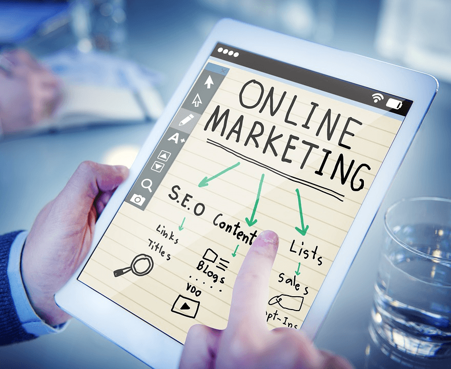
Advertising a business, particularly a new one, is an exhilarating, terrifying, and exciting adventure all at once! A great marketing strategy goes beyond creating a website, social media accounts, and TV advertisements. To be a step ahead of your competition you need unique marketing materials that will make people promote your brand without them even […]

Owning a coffee business may be one of the most profitable businesses of all time. It’s because for most people, drinking coffee will never go out of style. Especially when you offer a one of a kind coffee product, you’ll surely earn a significant amount in this industry. Because of this, more entrepreneurs choose to […]
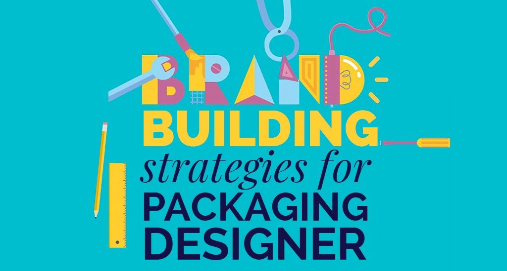
When we talk or hear about brand strategy, there is a common myth associated with it that is: it is related to only the logo, website and few creative ideas but that’s not true. It carries a lot of responsibilities on its shoulders and hence should be defined systematically. For brand strategies, it is essential […]
Whether you are in marketing, branding, web design, or graphic design, you already know how important it is to pick a good domain name for your projects. If you have tried a few domain name sellers, you already know how important it is to work with the right reseller. There are also good chances that […]
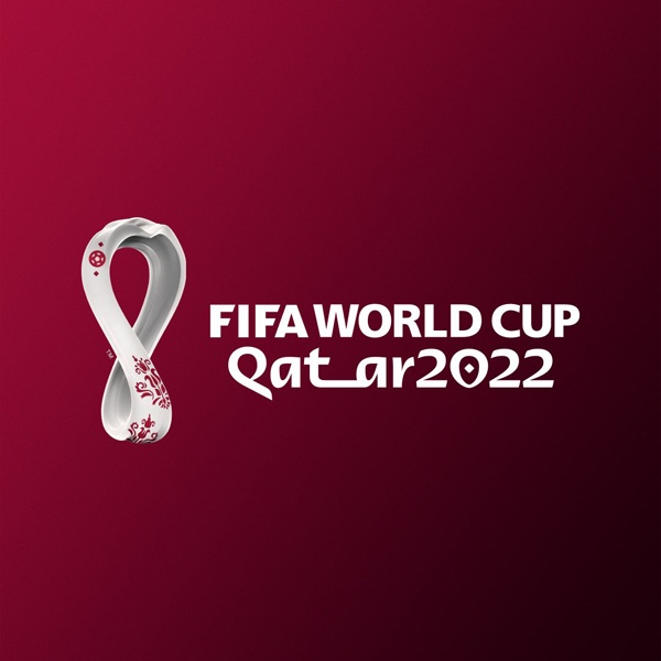
After the Olympic Games, the FIFA World Cup that takes place every four years in a different country every time is probably the largest international sport event in the world. With the recent release of the next World Cup’s logo, which was as usual heavily criticized by both designers and non-designers, we thought it would […]
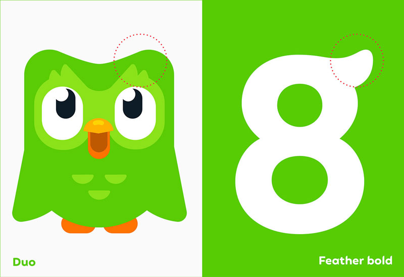
Many of Designer Daily’s readers probably already know of Duolingo, an app that most of us install to try to learn a new language and give up after two weeks (in the best cases). Recently, this very popular app underwent a rebranding that changed the face of its cute owl. Based on this illustration, a […]
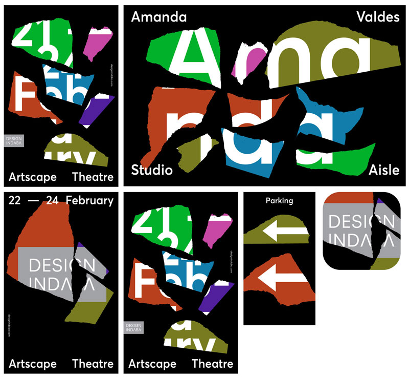
This work by Daniel Ting Chong for Design Indaba, a design conference that took place on February 2019 in South Africa, is not new, but I thought it was well worth a mention on Designer Daily. For this project, the designer went fully experimental and used AI tools to create the brand. Inputting 13 geometric […]
Building your brand online is not as simple as registering a domain name and creating a Facebook page to promote your products and services. Hard work, a commitment, Establish Your Brand’s Image When crafting and developing an image for a brand or a business, you only have one opportunity to make a positive and lasting […]
Branding is a very important aspect of your company’s marketing needs. As such, it is important that you take this issue seriously. You may choose to rebrand the company if you want to change some aspects of its performance. A company needs a creative team that is concerned with the brand and visibility of the […]
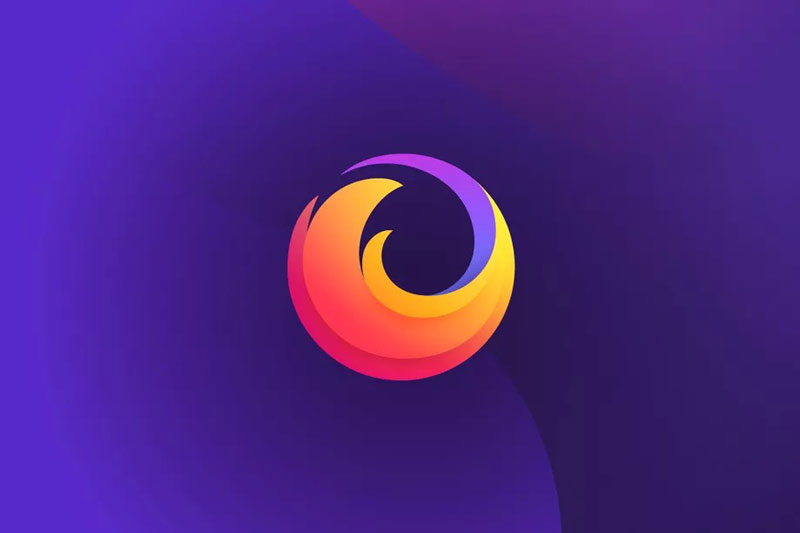
It’s not an easy task to redesign a successful and loved brand like Firefox. With millions of users and thousands of people involved in the development of the browser, the attachment to the cute fox (which is actually a red panda) swirling around the world is much bigger than it would be for a regular […]

