Logo designers at their best, some great inspiration for all graphic designers.
Refinery 43 is one of these super reliable design studios. They are not superstars, but you can count on them to always produce top notch design work. Located in Newburyport, Massachusetts, they work as a small team to do big things. But just see for yourself.
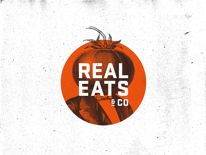
When you come from Europe, the tipping culture is a somewhat surprising part of American culture. Tipping culture means that waiters are not getting paid well if the restaurant has little business. When business goes well, waiters are getting a share of the revenue that is not really fair for chefs, dishwashers, and all other […]
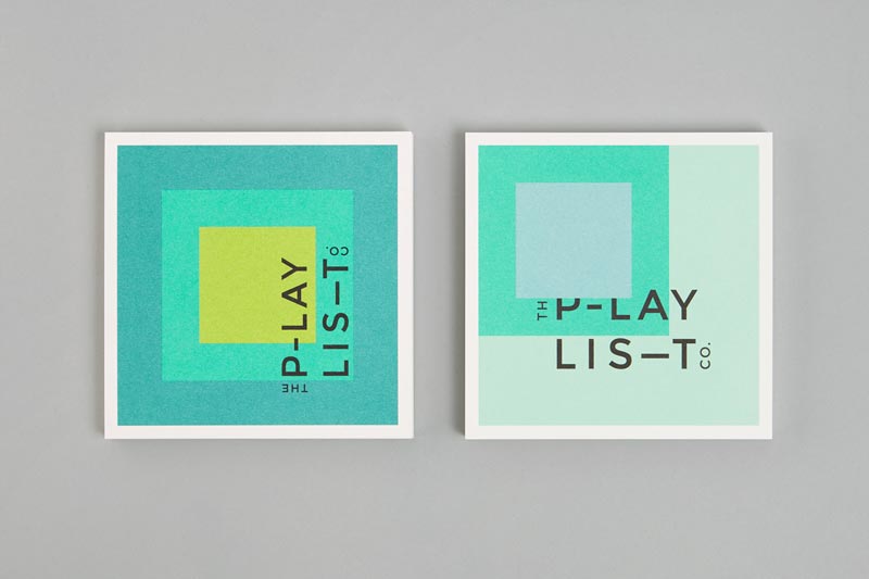
Toronto based graphic design agency Blok created a pretty cool geometric branding for The Playlist. While grid-based, this identity is just as playful as you would expect it. The designers had fun moving the colors around to create layouts that match the music business consultants’ activity.
On Designer Daily, we’ve often discussed the importance of white space, here is some practical inspiration in logo design. Knoll A subtle logo that looks like a gift, designed by NB branding & communication. Ryan Biggs associates A clever way to combine the company name’s initial letters. Design by id29. Yoga Australia Nice way to […]
The Tokyo 2020 Olympics logo is a disaster. It’s not a matter of design, the official logo doesn’t look too bad. The problem comes from all the controversy that came with the creation of the logo. The first logo proposal was abandonned because of plagiarism accusations, so there is a lot of bad PR around the branding […]
Graphic designers’ job consists mostly of transmitting messages in a simple, visual manner (to make it short). This is never as obvious as with logo design. A logo must express concepts in a matter of second, with very little visual elements used. While not always the most pretty, the following logos are great examples of […]
Using type, a grid and some textures, Greek graphic designer Dimitris Papazoglou created a stunning new branding for architecture studio Urban Soul Project. The type is derived from a deconstruction of the monogram of the brand, the letters extracted are then turned into a new writing system. Urban Soul Project turned to Papazoglou at the time […]
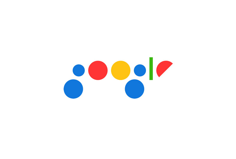
Graphic design Bruno Bua, from Portugal, had a lot of fun with the Google logo. He tried to imagine a minimalist re-branding using only geometric shapes and the Google colors. This logo is not truly outstanding or practical, but it shows some interesting thinking on the shapes that form the identity, and some thoughts on […]
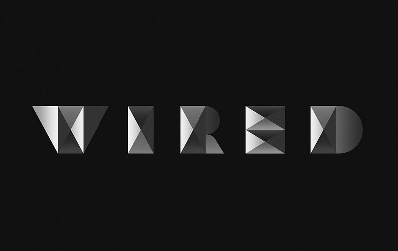
Wired magazine is the type of publication that has enough confidence in its brand to go ahead and get a different logo for social media usage. For that, they hired Sawdust, who did a great job giving the logo some perspective using some shaded triangle shapes.
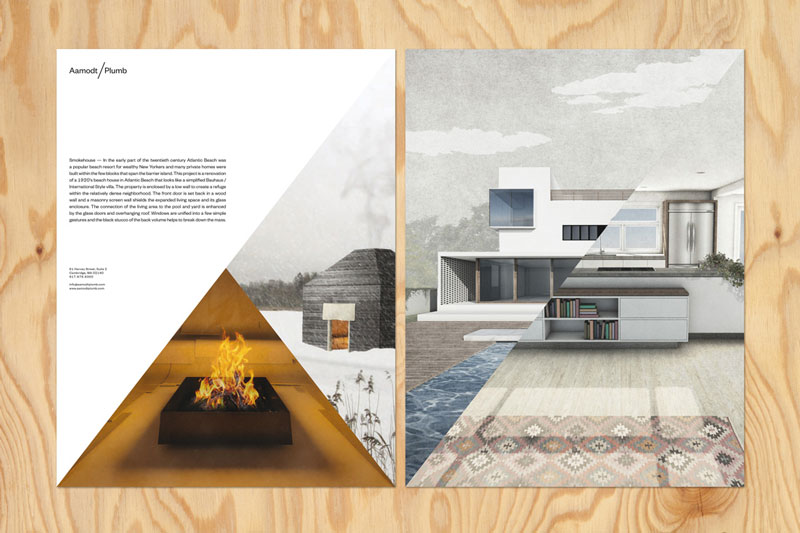
Commissioned by the architecture studio Aamodt/Plumb to design their new visual identity, TwoPoints.net built the whole branding system around the slash in the name and the duality it implies. The diagonal separation is found throughout all the architects’ marketing material, it works particularly well on brochures and catalogues. The design agency also did a great […]
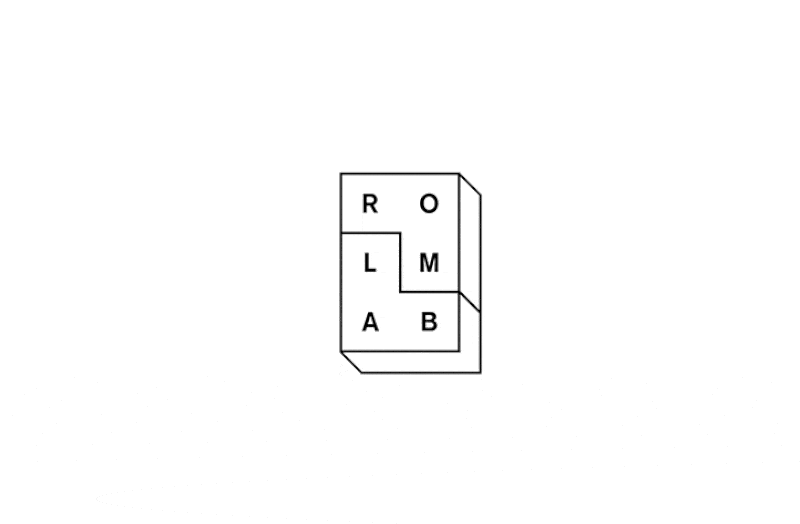
Tetris was a big deal for my generation when growing up. It had such an impact that designers keep creating things that are inspired by the little assembling blocks, like Tetris bookshelves, Tetris soap, or Tetris sticky notes, for example. For Romlab architects, design studio Bleed also took some inspiration from Tetris to create a […]
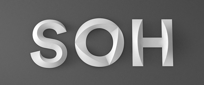
The Sydney Opera House is famous worldwide for its audacious architecture, it’s one of the few buildings in the world that makes the skyline of a city instantly recognizable. While the new logo designed for the Opera will probably not get as much attention as the building’s architecture, it is still innovative and worth taking […]
Marco Schembri is not a graphic designer, he currently works as an industrial designer in his home country, Italy. He did however show some good branding design skills and a sense of humor with his funny logo project. The Italian designer took some popular brands and tried to imagine what they would look like if […]
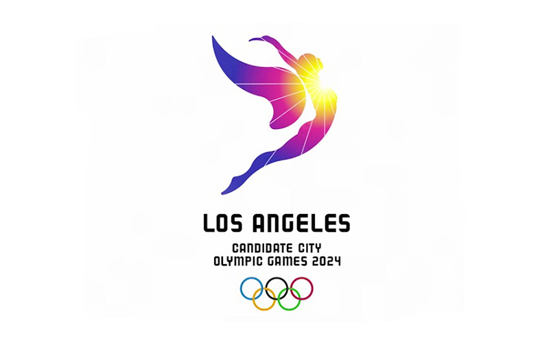
For its bid to organize the 2024 Summer Olympic games, the city of Los Angeles decided to communicate around the good weather and went for this slogan: “Follow the sun”. This already sounds like a cult advertising, but you get the full cult-feeling only when watching their weird promotional video (see it at the end […]
Are you soon going to launch your startup and looking for a unique logo design to attract people? There is no denying to the fact that a high quality logo is one of the most important design elements when it comes to engaging people and thus, increasing sales. It is the face of your company. […]

