Typographic inspiration, tools and resources. Find even more on our typography blog.
Typography has become fundamental in web design projects. It makes the copy clear, legible, and appealing to readers as it’s considered an art of arranging text and letters. Typography assists in providing an excellent experience for users before they even click a button or read. It tells a story that provides users information about the […]
One crucial component of an excellent website is to have clear communication. It is vital as it establishes a relationship between the brand and the user. Around ninety percent of all information is text. Text is represented through typography – it is a way to communicate efficiently. It is the primary thing that leads your […]
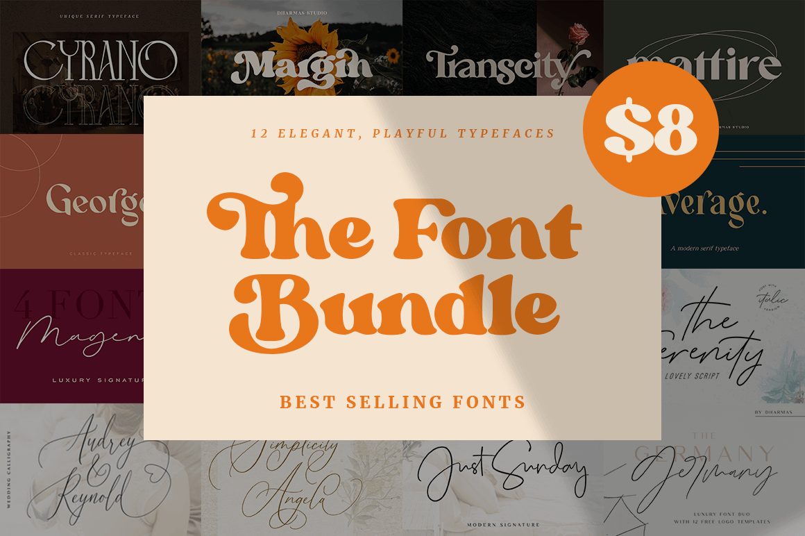
Every week, we’ll give you an overview of the best deals for designers, make sure you don’t miss any by subscribing to our deals feed. You can also follow the recently launched website Type Deals if you are looking for free fonts or font deals. 12 Elegant, Playful Typefaces This gorgeous bundle features 12 typefaces that are just perfect […]
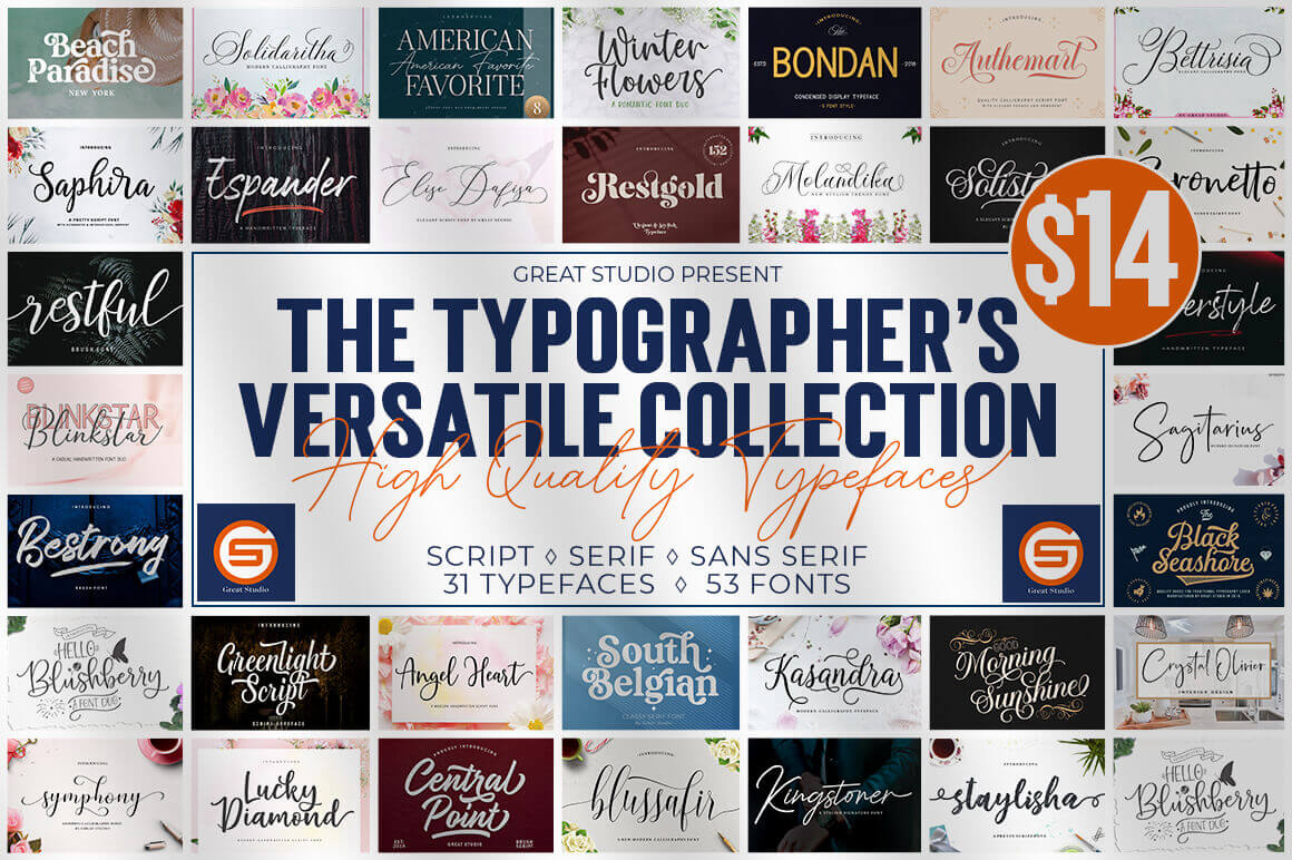
Every week, we’ll give you an overview of the best deals for designers, make sure you don’t miss any by subscribing to our deals feed. You can also follow the recently launched website Type Deals if you are looking for free fonts or font deals. The Typographer’s Versatile Collection The Typographer’s Versatile Collection is chock full of 53 different […]
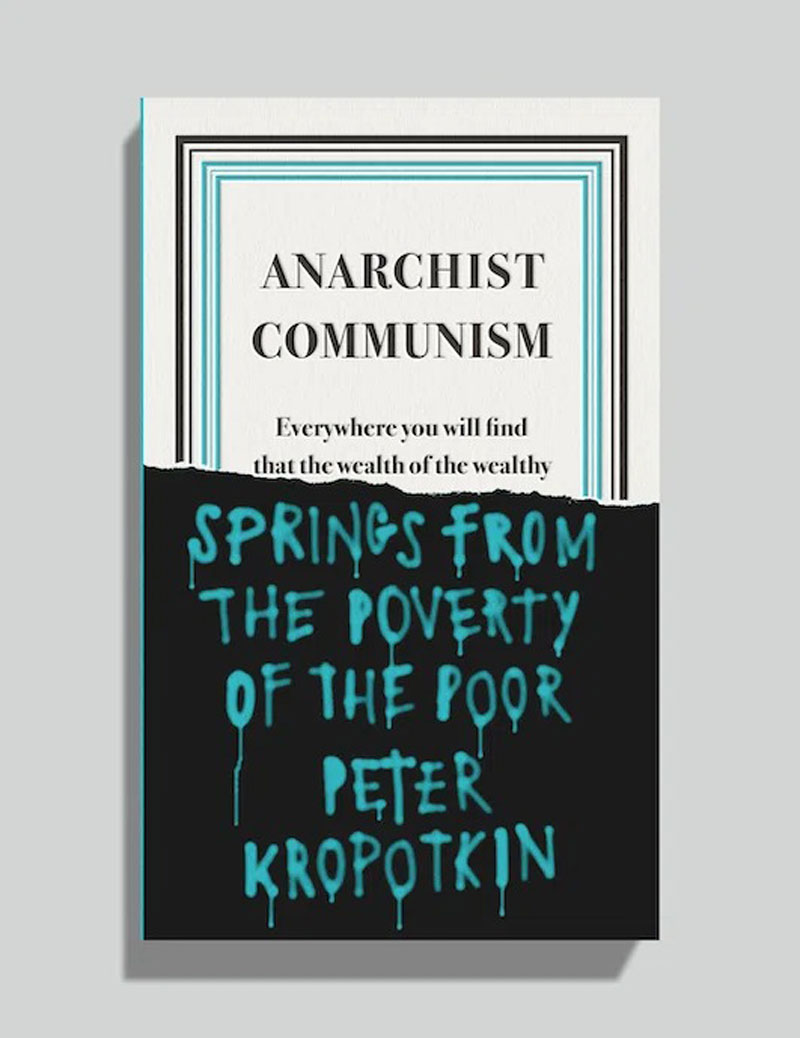
For its Great Ideas series, Penguin worked with book cover expert David Pearson, a graphic designer based in the UK. The designer took a type-based approach to nail the covers of these non-fiction books that feature no less than authors like George Orwell, Virginia Woolf, or Karl Marx. Pearson’s collaboration started early in the branding […]
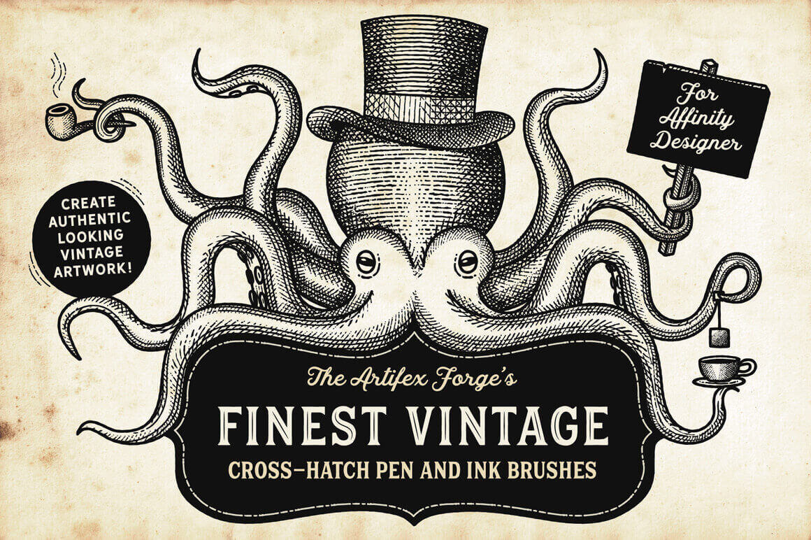
Every week, we’ll give you an overview of the best deals for designers, make sure you don’t miss any by subscribing to our deals feed. You can also follow the recently launched website Type Deals if you are looking for free fonts or font deals. Artifex Forge’s Finest Vintage Set of Affinity Brushes With the Artifex Forge’s Finest Vintage […]
Typography can also be used to help other, Derek Friday proves it with his lettering prints project. The artist is creating prints of letters, in a 36 days of Type fashion, that he sells in order to collect funds that he gives to restaurants that have been hit by the COVID-19 pandemic.
In simple terms, typography is the design of letters to make written words both readable and appealing. The origins of typography go back to ancient Greece, around 3,500 years ago. It was first implemented in the punching of currency and official seals. Instead of writing the letters every time, the Greeks used a Phaistos Disk, […]
Typography is not just about making words easy to read. It is considered an art for arranging type within the layout, which includes the management of the color scheme, grid, and other techniques to form a professional design. There are basic things to consider in applying the art of typography for your design. As a […]
Digital design is great, it opens a range of possibilities that were unheard of previously. However, sometimes you just want to give a more human, non-digital look-and-feel to your designs. Unfortunately, you cannot always work by hand on your designs for obvious time reasons, but there is a solution, thanks to great online resources. Here […]
Named after an American psychedelic rock band, Love, this typeface was designed by Jérémy Schneider, a French graphic designer who runs the VJ Type Studio alongside with his life-partner Violaine Orsoni. The name of the font is not only about music, though. It also refers to the letterform’s shapes and the embracing ligatures in particular. […]
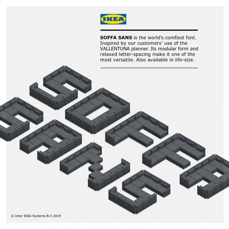
IKEA tries to innovate regularly and adapt their way of selling to their clients’ evolving buying habits. As part of this innovating mindset, they released a pretty cool couch building online tool. Things did not go exactly as they planned, as users quickly started to have a lot of fun with the tool and built […]
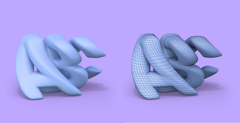
Based in Berlin, Germany, Hightype is a type foundry that specializes in the creation 3D typefaces. Founded by Manuel Rossner, it was launched recently and promises to bring good type to VR, interaction design, games, 3D printing, and branding. To use Hightype’s fonts, you will need to be familiar with 3D software and technologies (obviously). […]
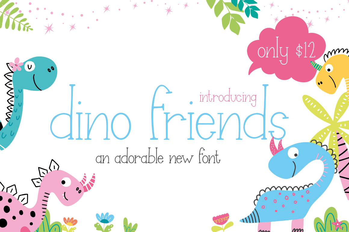
Dino Friends is probably the cutest font you will see in the entire month. It is a handwritten thin slab-serif font that immediately creates a sense of friendliness. Normally, the font would cost $12, which is a pretty cool price already for a quality typeface. For Designer Daily, our friends at the Free Design Club […]
Many graphic designers dream of designing fonts and publishing them, but never do it. Alex Mihis did it, he is now running a popular online type foundry at Headfonts. We asked him a few questions about this experience. Hi Alex, can you introduce yourself to our readers? Hello! My name is Alex Mihis. I live […]

