Typographic inspiration, tools and resources. Find even more on our typography blog.
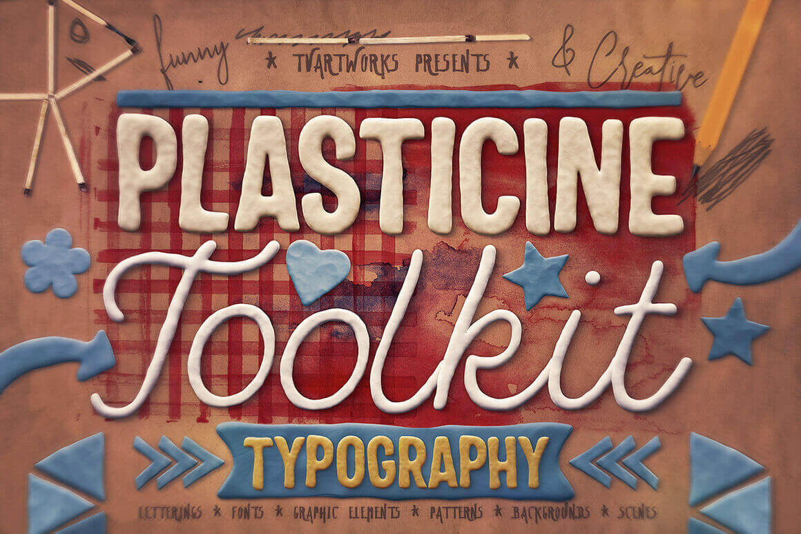
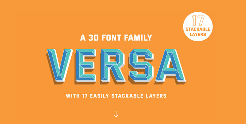
Every week, we’ll give you an overview of the best deals for designers, make sure you don’t miss any by subscribing to our deals feed. You can also follow the recently launched website Type Deals if you are looking for free fonts or font deals. Plasticine Typography Toolkit This fun toolkit features 3D style letterings, color fonts and graphic elements […]
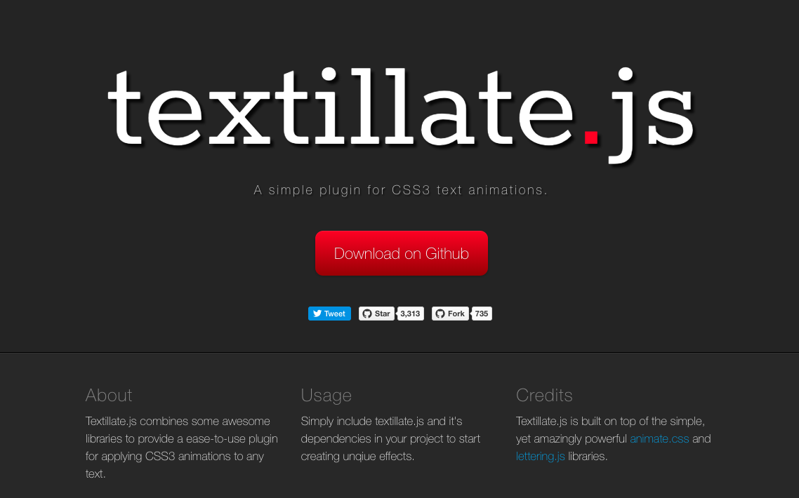
jQuery typography and text effect plugins will give you more control to precisely position and re-size each letter of your web typography in order to make websites more beautiful and appealing. Text animation is a preferred way to highlight the text and catch attention of users. These text effects as jQuery plugins are tiny, easy […]
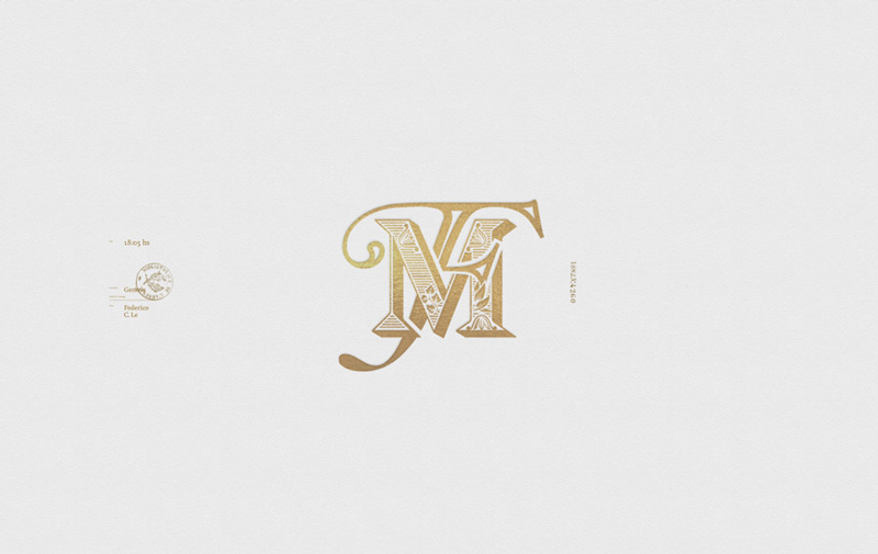
In an era where minimalist designs are praised, Martin Schmetzer’s work really stand out with all its details and flourishing letters. Based in Stockholm, the illustrator and designer specializes in typographic illustration and design. The samples of work you can see in this post are only a part of his branding work, you can see […]
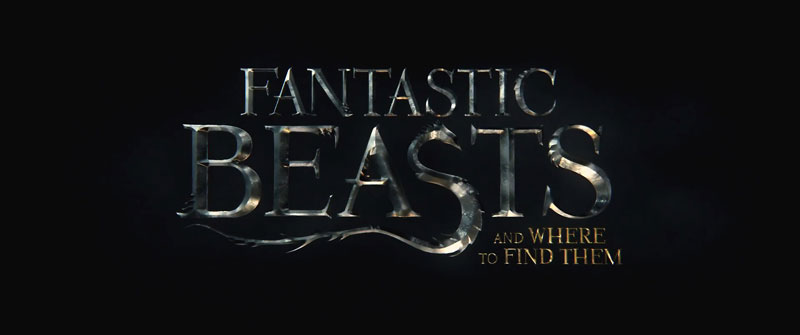
Having your work seen in a prominent movie is every designer’s dream. For Emily Oberman, it became true when she was commissioned to design the new typographic identity of Fantastic Beasts. With her team at Pentagram, they created a font for that purpose. It was appropriatly named Crimes New Roman. The font comes with a […]
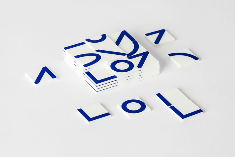
Galapagos is a new kind of game, designed to allow you to play with shapes and form letters and typographic compositions. It was based on principles of self-learning, with 54 building blocks printed with nine different geometric shapes that can be laid out to form endless combinations of letters, words, and other types of abstract […]
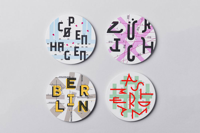
When it comes to designing touristic information, graphic designers rarely skip the obligatory photos. It makes obvious sense, but it also makes this industry’s design work less interesting. In an interesting project, the designers at Dotto, a design consultancy based in Manchester city, UK, published some small and hipsterish guides to fun places in four […]
We all know this piece of popular wisdom: “The devil is in the details”. Designers all know how true it is. Obviously, a poorly designed project will not be saved by thoughtfully designed details, but a well-designed project can be ruined by overlooked details. This is particularly true for branding projects, that’s the reason why […]
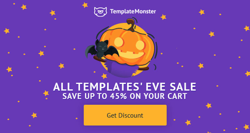
Every week, we’ll give you an overview of the best deals for designers, make sure you don’t miss any by subscribing to our deals feed. You can also follow the recently launched website Type Deals if you are looking for free fonts or font deals. TemplateMonster Halloween Deals TemplateMonster is marketplace of Digital products. You will find different templates designs, […]
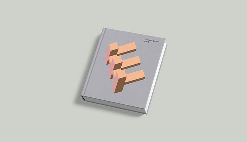
Even if you love typography, there are chances that you don’t know Takenobu Igarashi yet. The Japanese designer is more famous in his home country, but his work is definitively worth a look. A recent crowdfunding campaign launched in Japan gives you the perfect opportunity to discover the 3D lettering of the type master. In this […]
h3l, a branding agency based in Argentina, recently released a great visual identity for Familia Mastrantonio. The scope of the work included the company logo, as well as packaging and identity for three wines.
How did you discover typography and decide that it could become your job? I first came into practising typography at the age of only 14. I was looking for something, anything, to do other than play video games which I had become completely bored of. I begin by learning copperplate calligraphy, then hand lettering, and […]
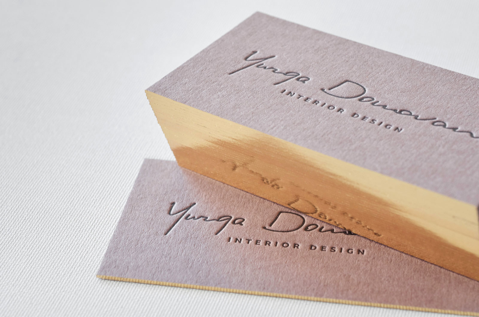
A great business card should convey the overall motto and images of your business. It is a not an easy task considering the fact that an average business card only measures 2 inches in width and 3.5 inches in length. It is inconsiderate to have the thought that your business card will portray the entirety […]
Every week, we’ll give you an overview of the best deals for designers, make sure you don’t miss any by subscribing to our deals feed. You can also follow the recently launched website Type Deals if you are looking for free fonts or font deals. Master InDesign CC 2018 with the Online MasterClass Course Arguably one of the industry’s […]
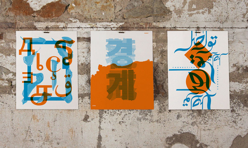
Design as a tool that breaks borders. Sounds too good to be true? Maybe, but it was the theme of this typographic project organized by Mayúscula, a design studio based in Barcelona. The concept was simple: invite designers from all overs the world to send a creation with a black graphic on the theme “Design […]
Typography continues to be overlooked by many designers yet it is a very important aspect of the design process as choosing the right typeface can make a real difference to the effectiveness of the design. Typefaces are just as important to the visual effect of the webpage as images. Typography does not just involve choosing […]

